Scroll
WORK EXAMPLE
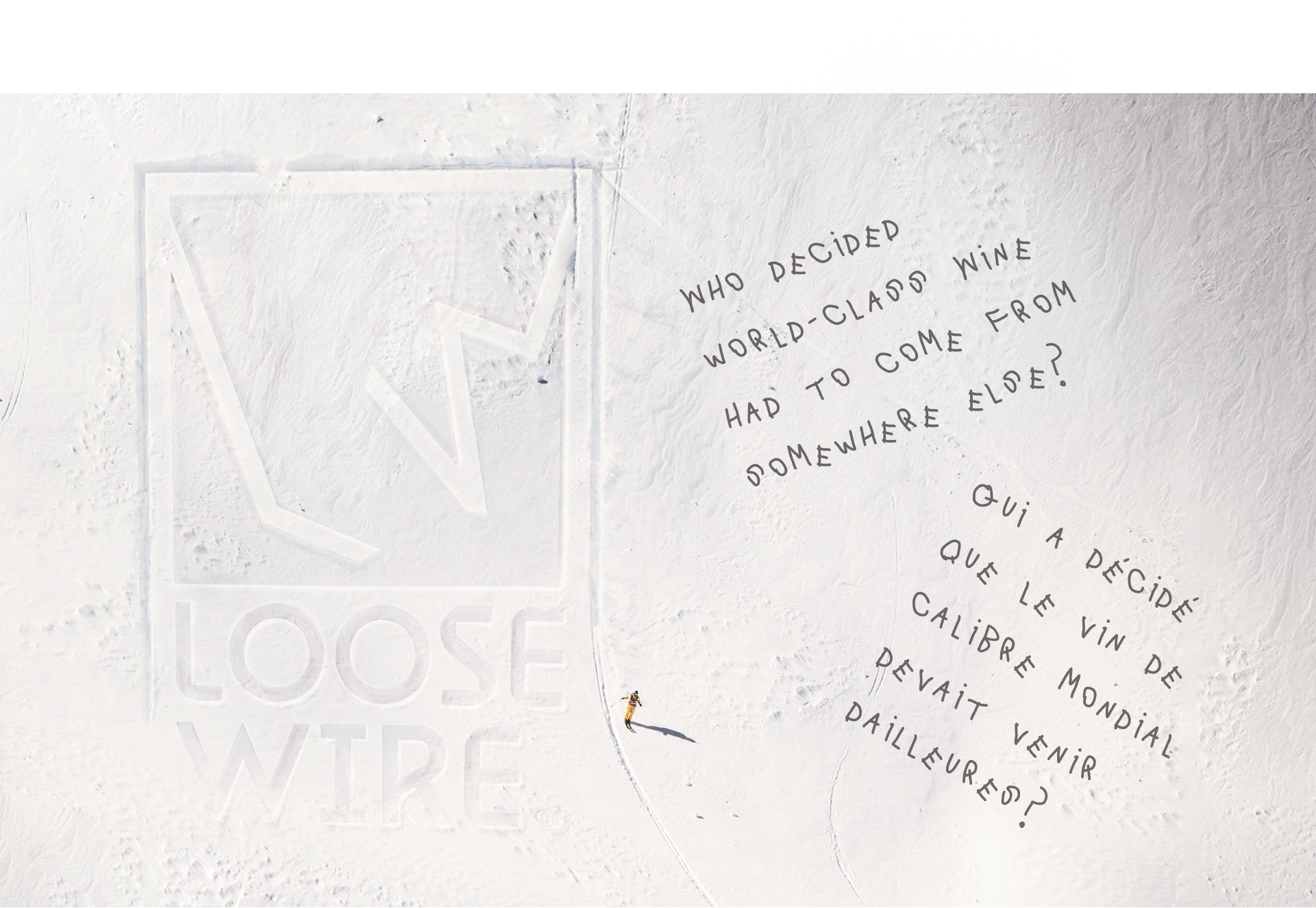
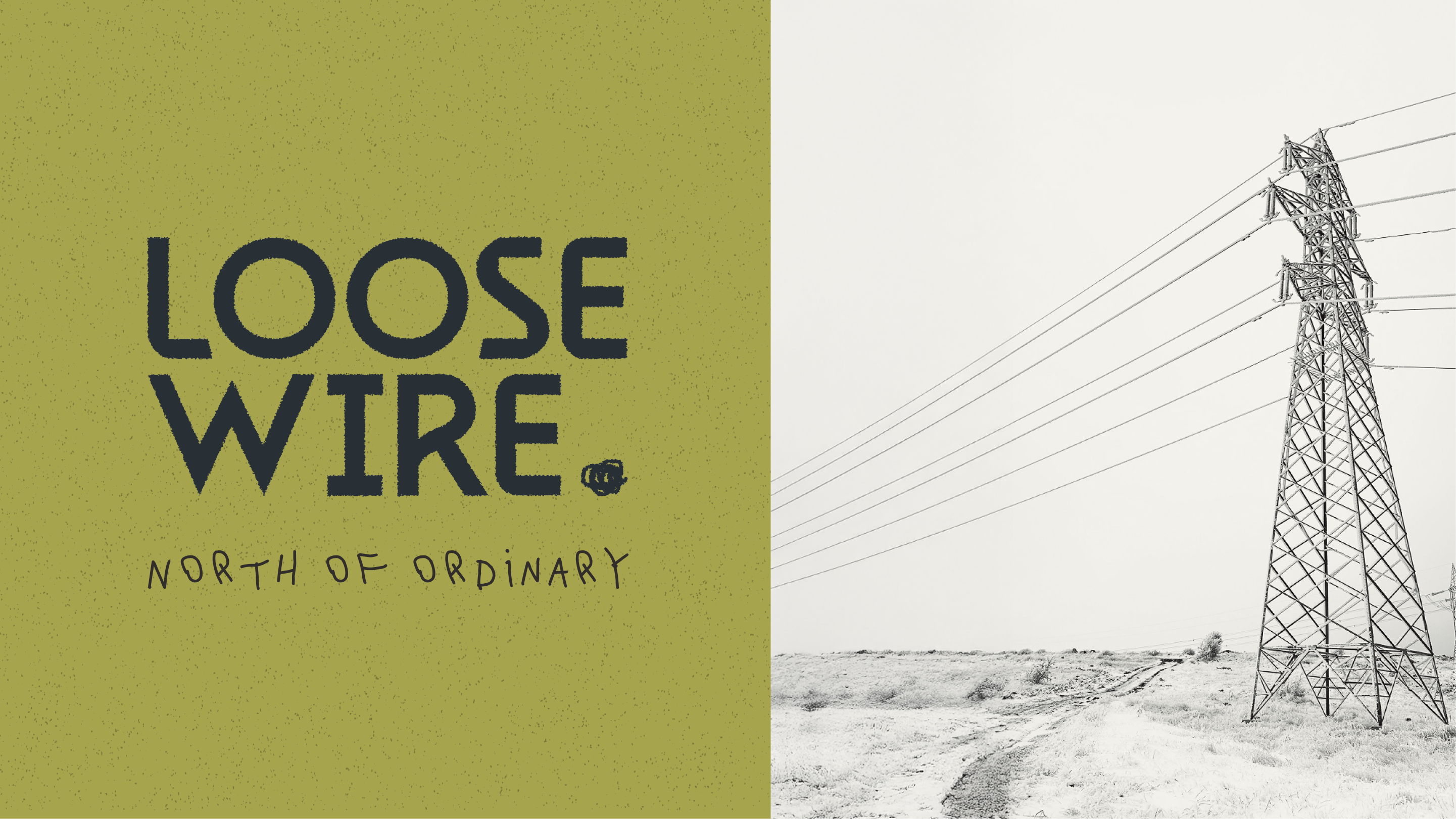
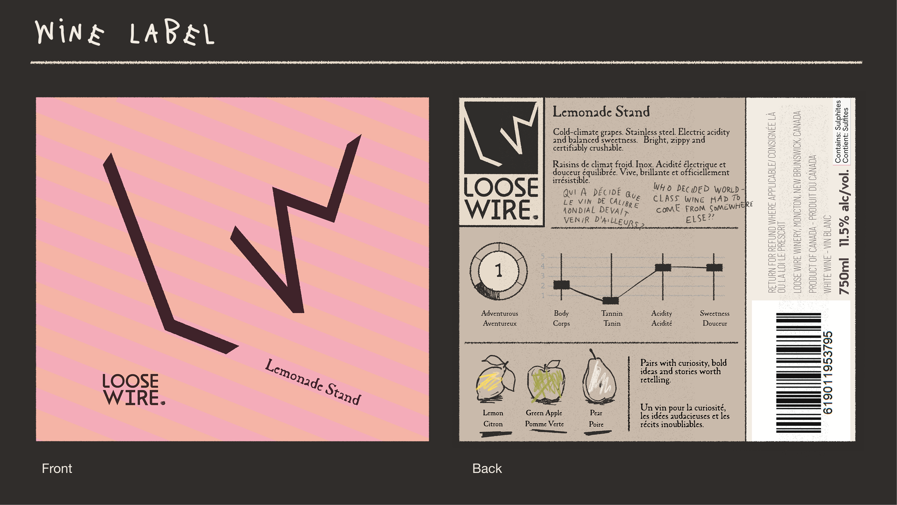
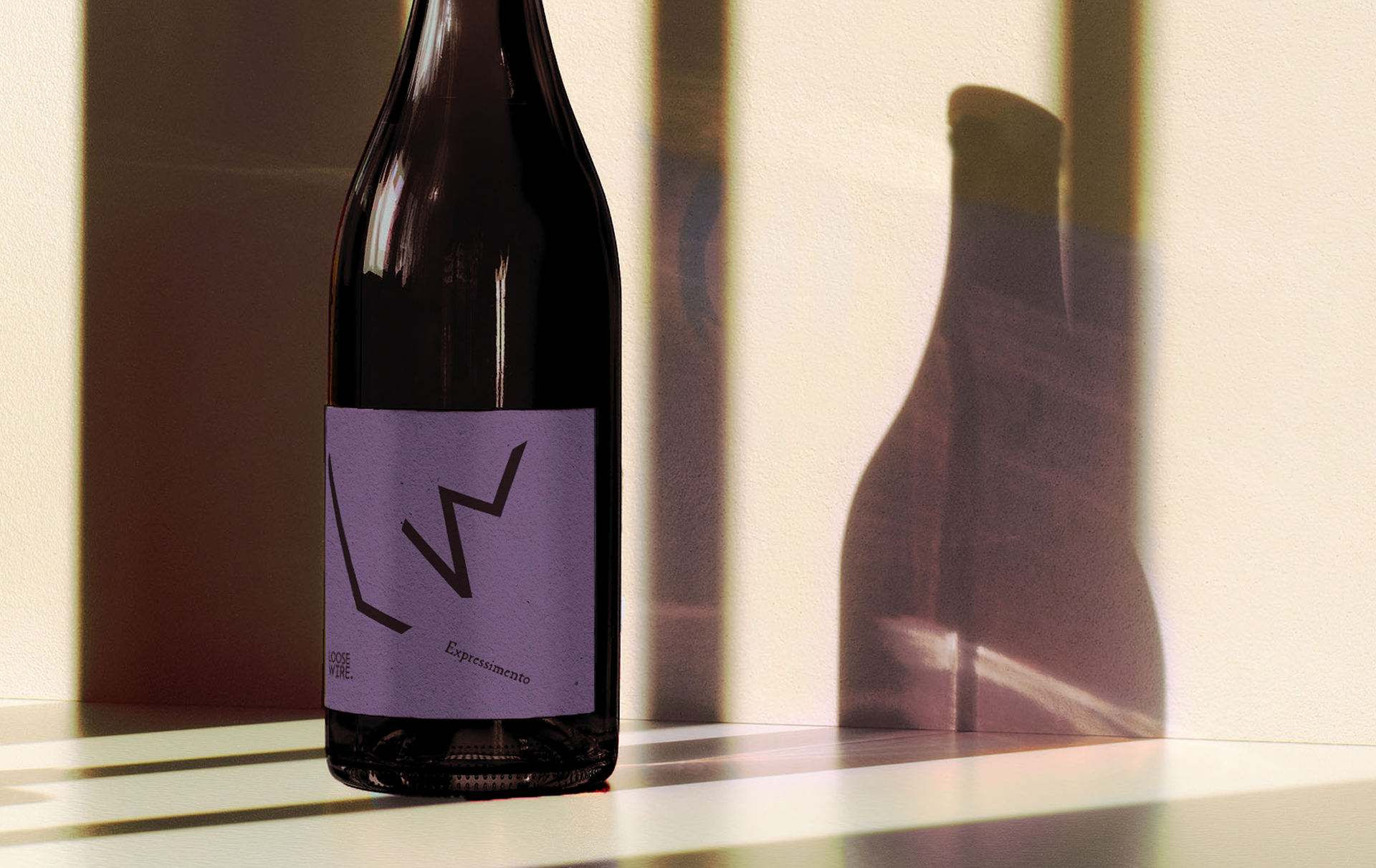
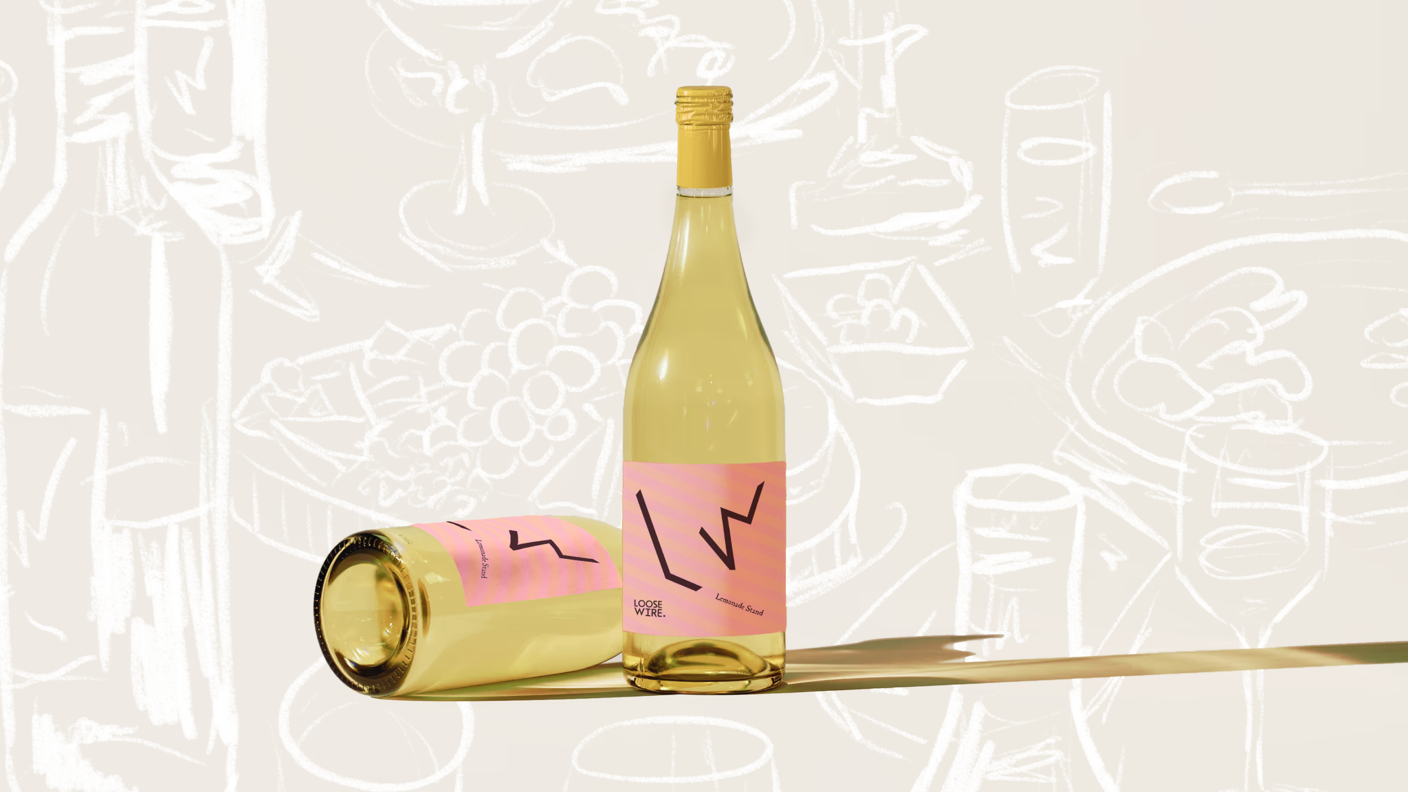
LOOSE WIRE WINERY
Deliverables

Company Background
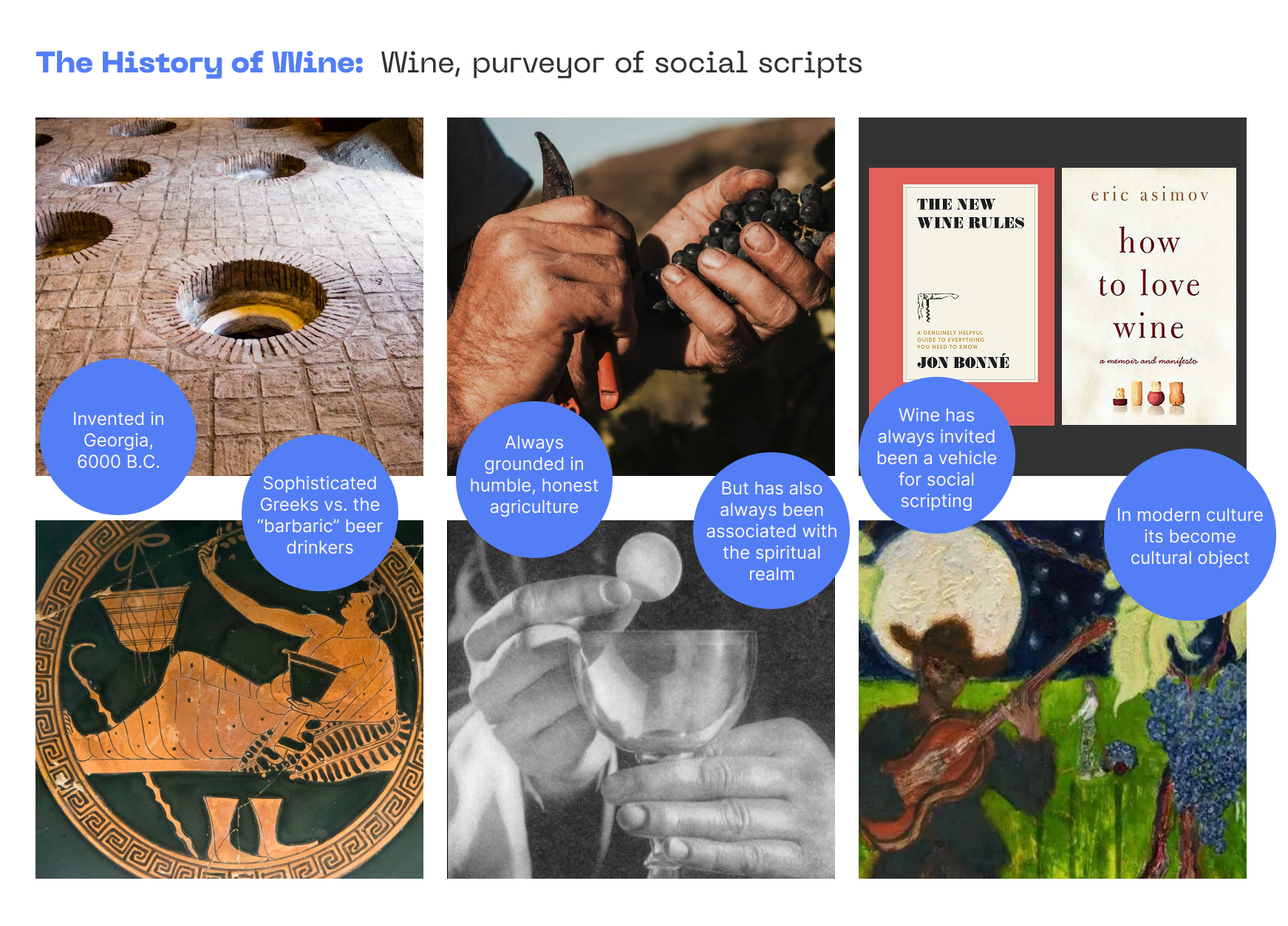
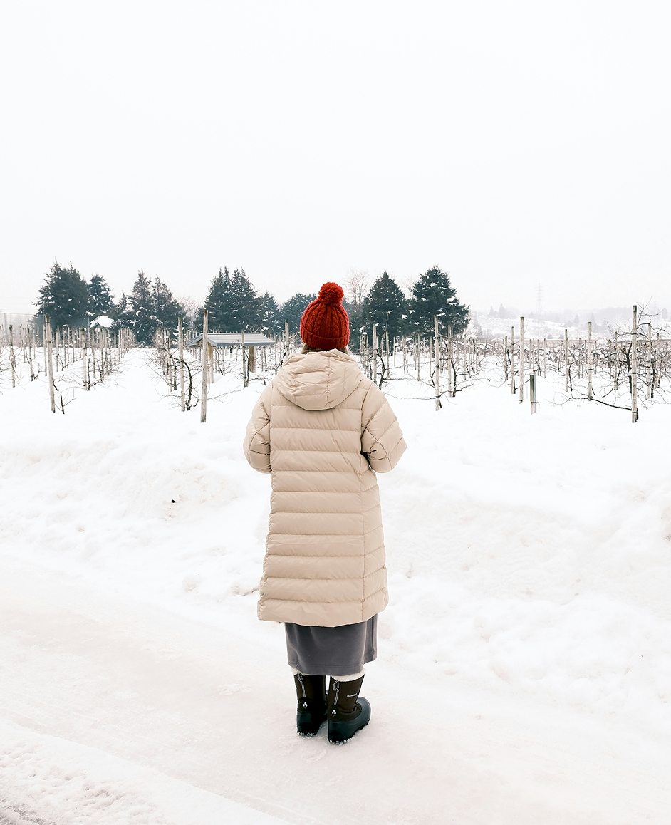
Loose Wire Winery is a symbol of re-evaluation. It asks: what is possible at -25C?
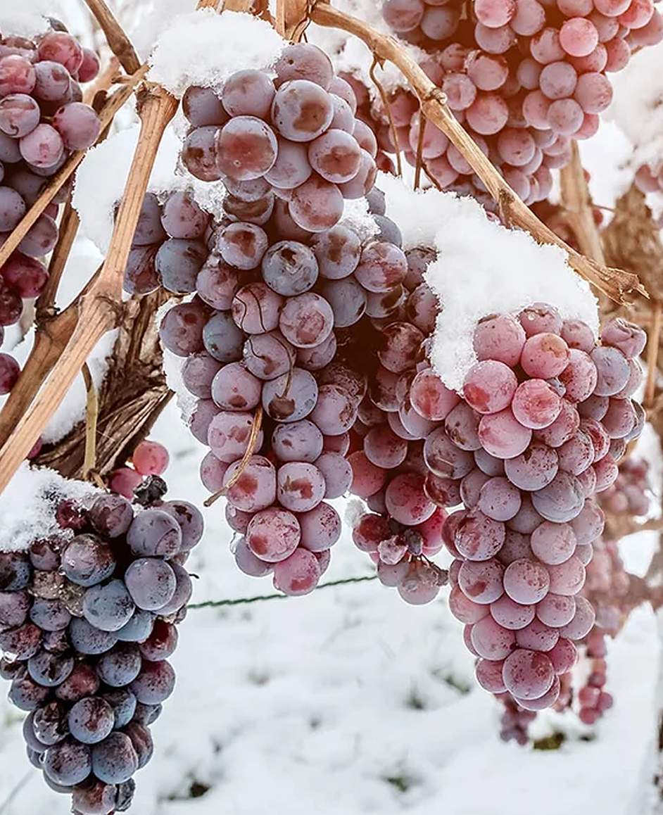
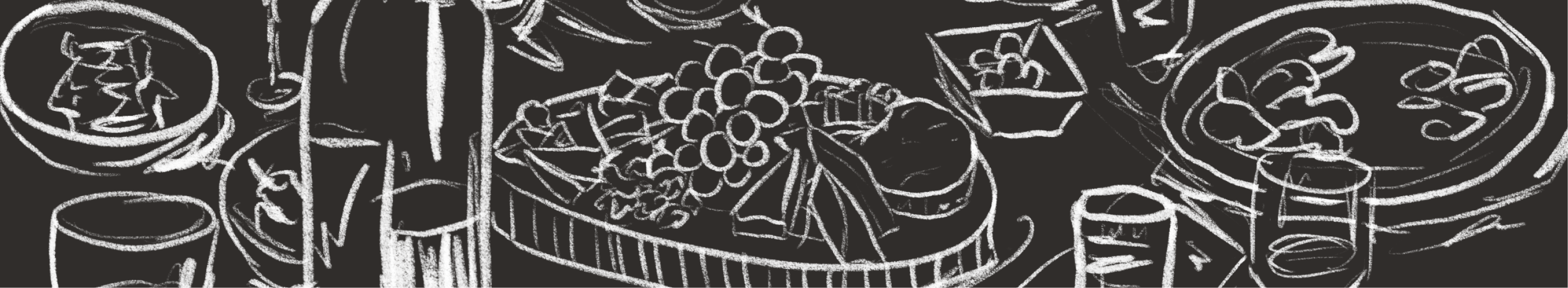
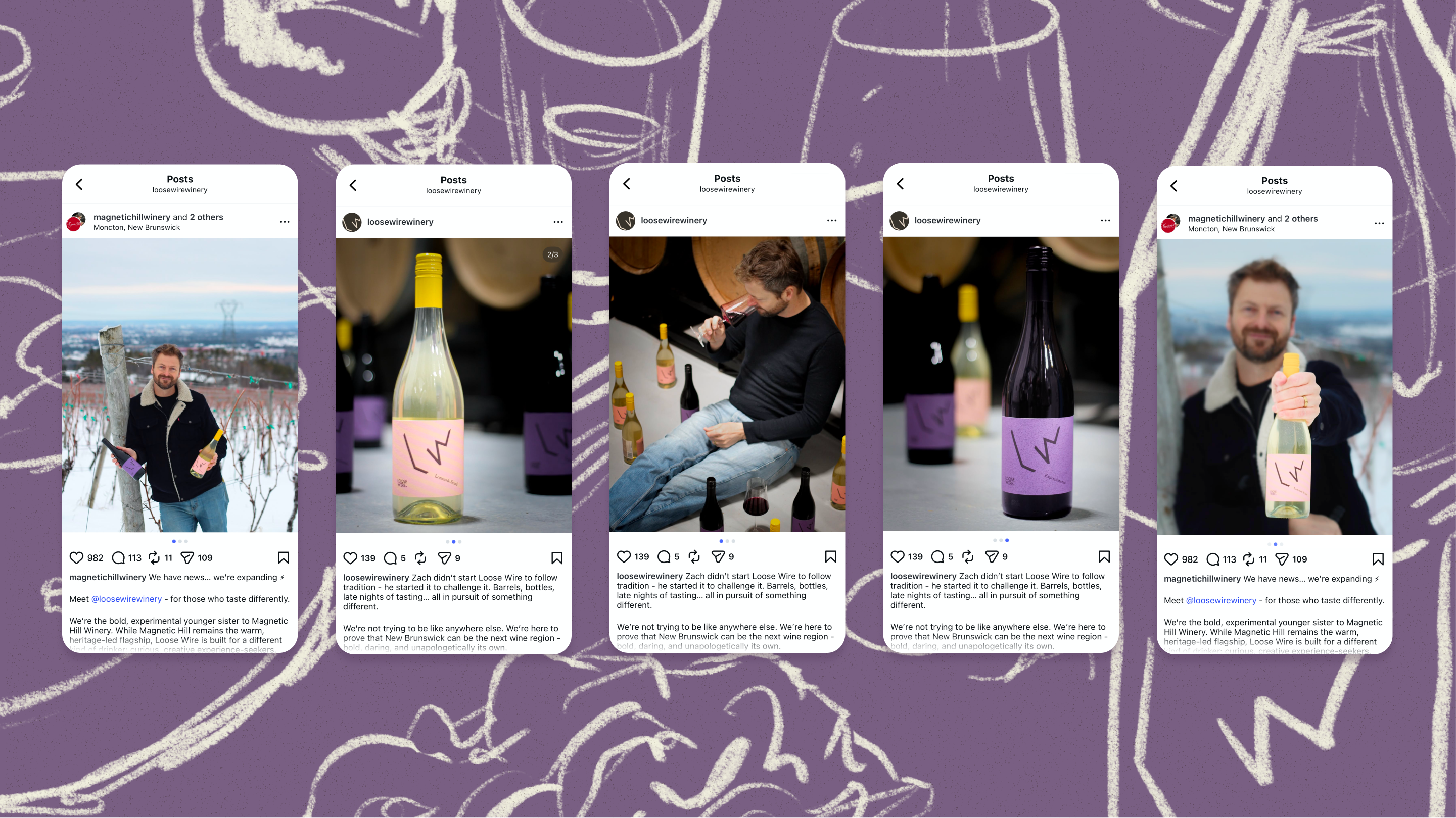
After two decades of establishing Magnetic Hill Winery as a local landmark, the Everett family is launching a new sister brand venture led by their son, Zach. Returning from European training with a technical, experimental lens, Zach is applying disciplined craft to the family’s cold-climate grapes. By utilizing intensive processes like the Appassimento method, Loose Wire forges award-winning wines that shouldn’t exist in this extreme climate.
After two decades of establishing Magnetic Hill Winery as a local landmark, the Everett family is launching a new sister brand venture led by their son, Zach. Returning from European training with a technical, experimental lens, Zach is applying disciplined craft to the family’s cold-climate grapes. By utilizing intensive processes like the Appassimento method, Loose Wire forges award-winning wines that shouldn’t exist in this extreme climate.
Challenge
The design required a strategic pivot from a brand defined by place (Magnetic Hill) to one defined by process (Loose Wire). Working on a condensed timeline with lead designer Mark Paterson, we had to forge a visual identity bold enough to signal a technical rebellion without alienating the family’s 20-year heritage.
Goal
Deliver a complete logo and label in time for the Q4 rush, the winery’s most critical selling window. We aimed to trade the 'standard pour' for the thrill of the unexpected, creating a visual identity that positions New Brunswick’s place on the viticulture global map.
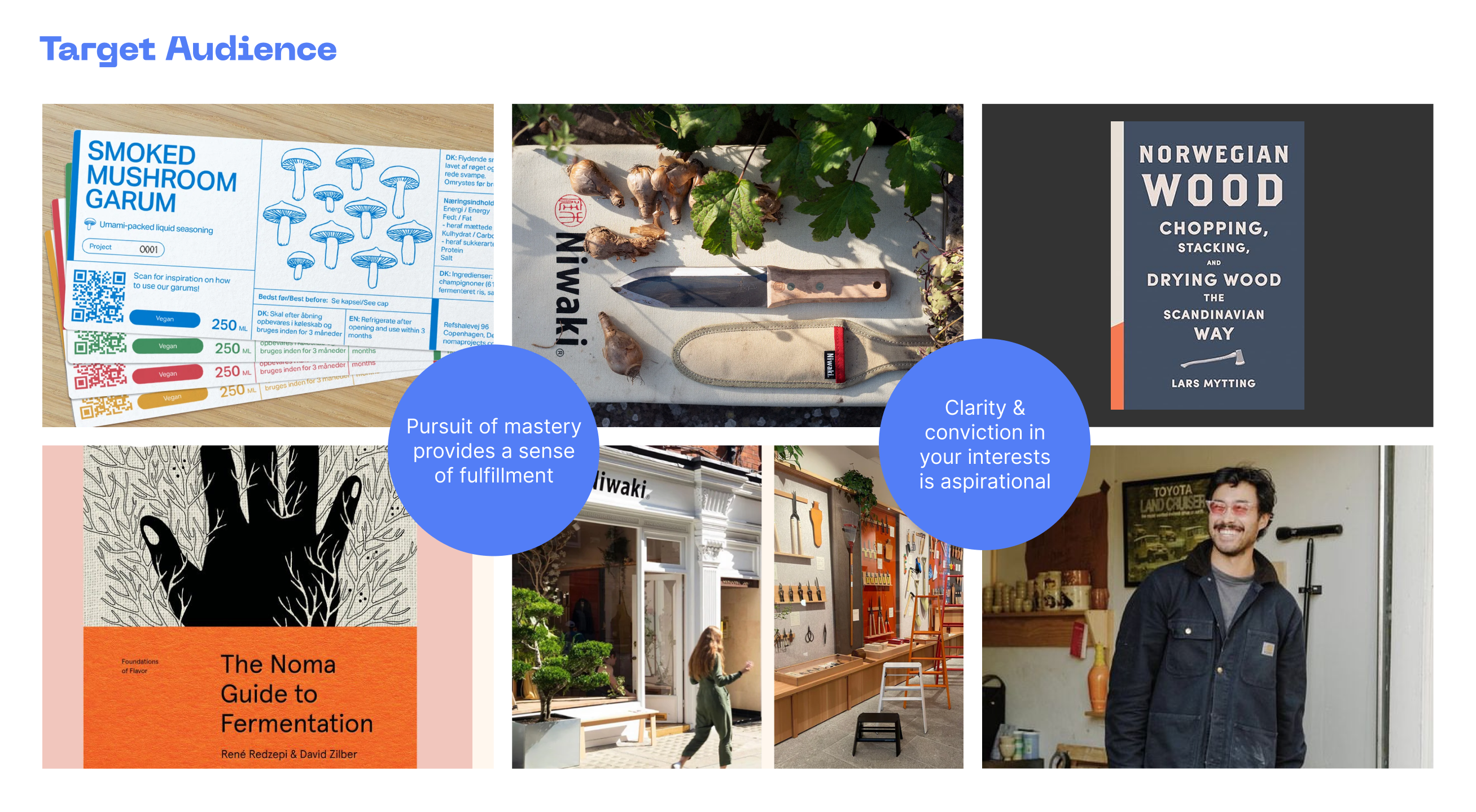
Target Audience
Discovery-seeking drinkers, who find traditional wine culture stuffy. They prioritize authenticity and craft explored from an angle.
Research

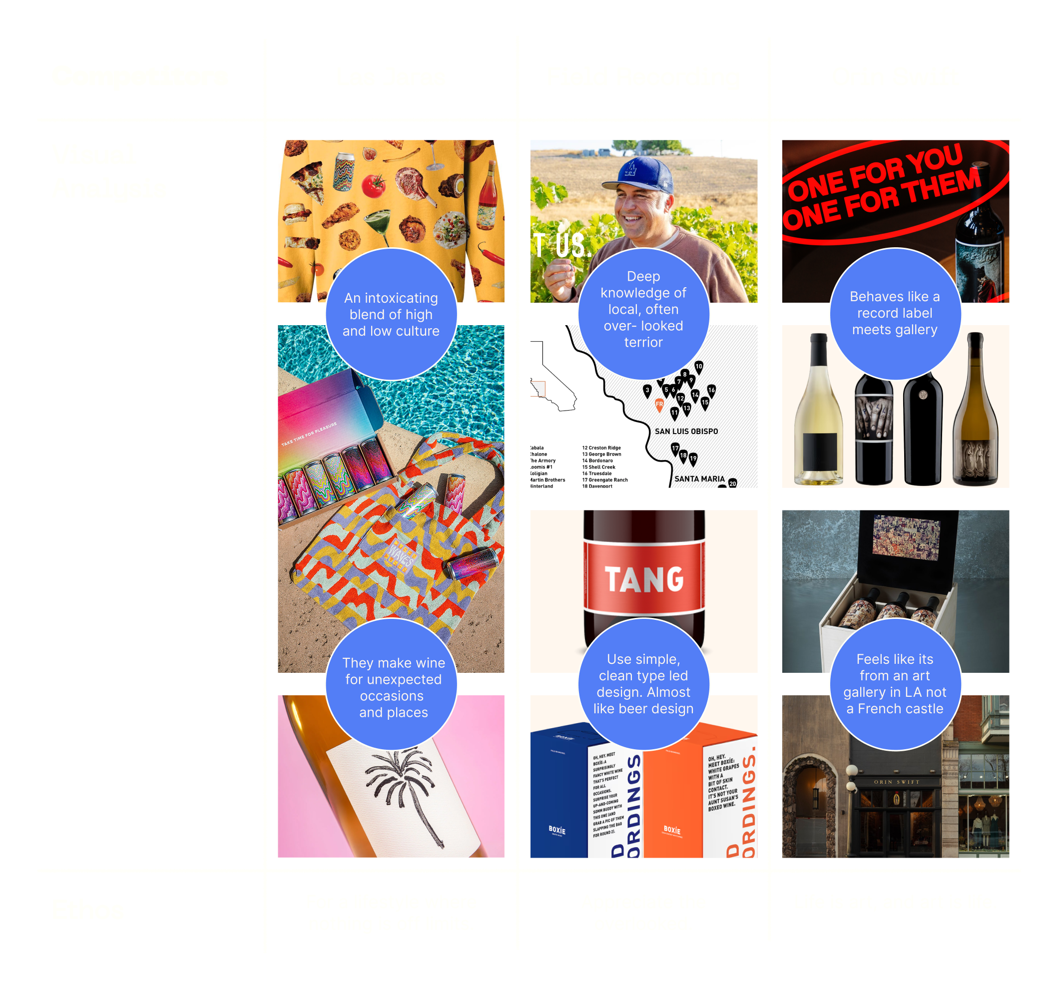
Competitor Landscape
These brands are the industry outliers that define the space where Loose Wire operates. They have claimed three distinct territories:
• Field Recordings sells simplicity ("the dirt is enough")
• Las Jaras sells lifestyle ("the moment is the destination")
• Orin Swift sells aesthetics ("the bottle is a canvas")
While they focus on the soil, the occasion, or the image, Loose Wire can position itself as a creative foundry. We use the "dirt" as a starting point, but apply technical, intentional processes to engineer a wine that shouldn't be possible in this climate. We don’t just celebrate the vineyard or the party; we celebrate the inventor’s spirit and the disciplined craft required to make something daring.
What's possible at -25°C?
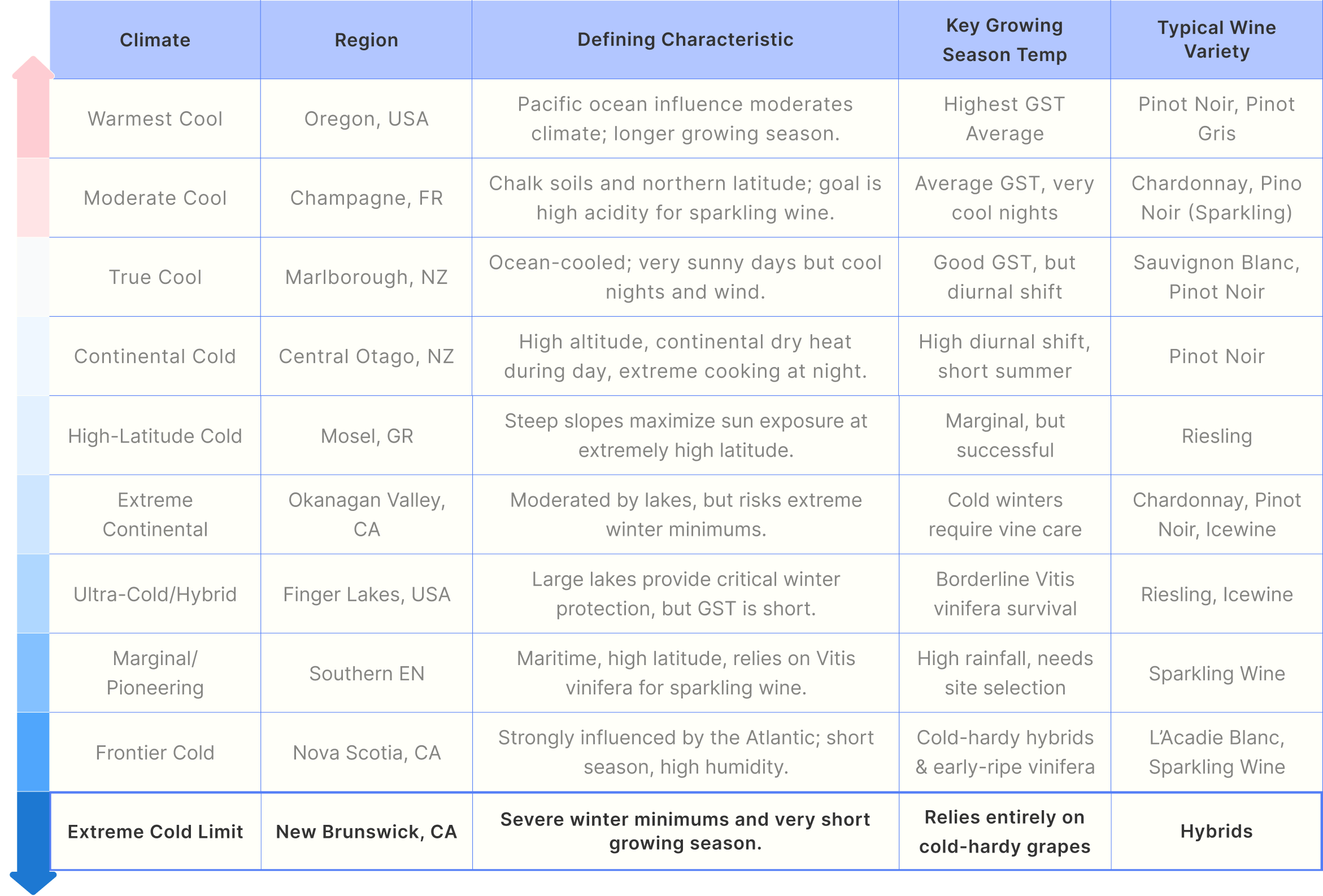
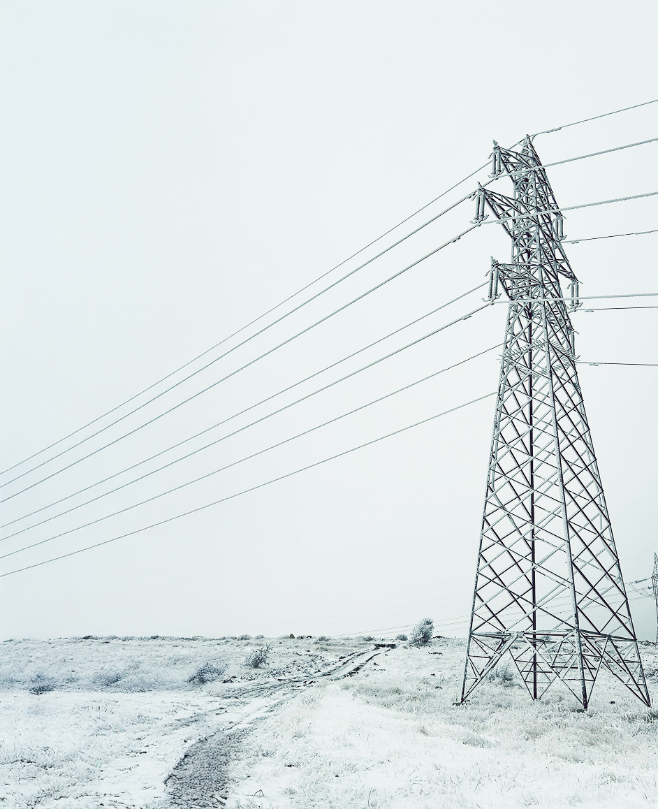
Loose Wire operates on the geographic edge of what is considered "wine country." While competitors seek the safety of predictable valleys, Loose Wire is located under a pylon on the outskirts of Moncton, New Brunswick, 7,300 miles from Tuscany. This harsh, high-latitude climate produces fruit with a distinctive, electric acidity, a raw material that requires a specific kind of resilience to master.
Viticultural Cold-Climate Spectrum
Common Narratives:
- Mastery is integral to a life well lived.
- The “how” is just as important as the “what”.
- Curation is a form of self-expression.
- Intentionality is an act of quiet rebellion.
- Perfect is boring.
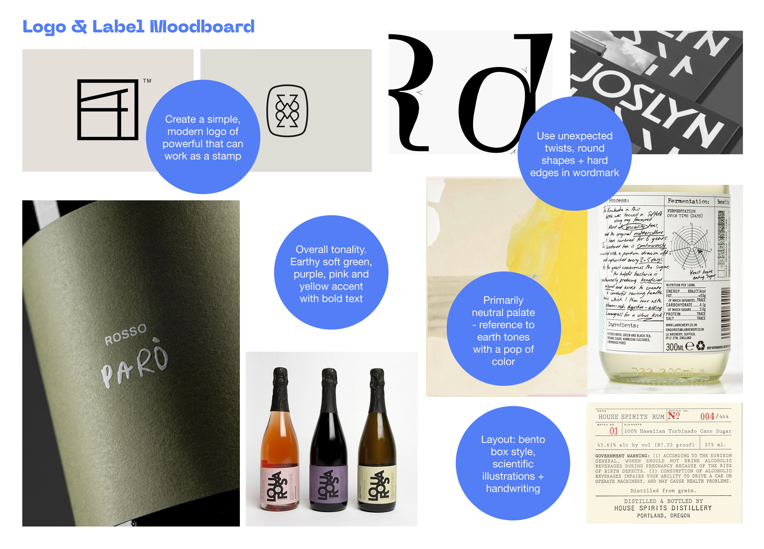
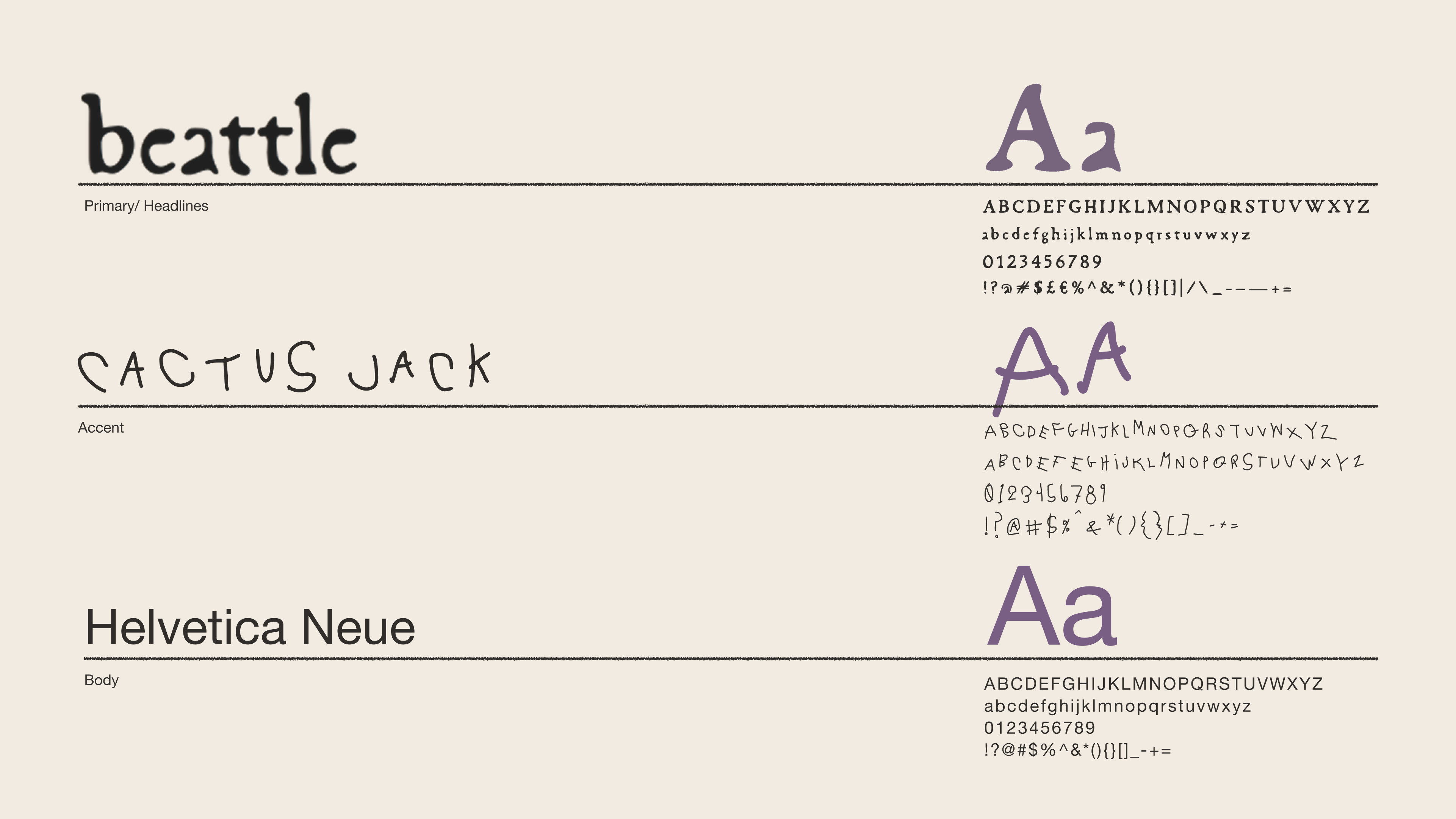
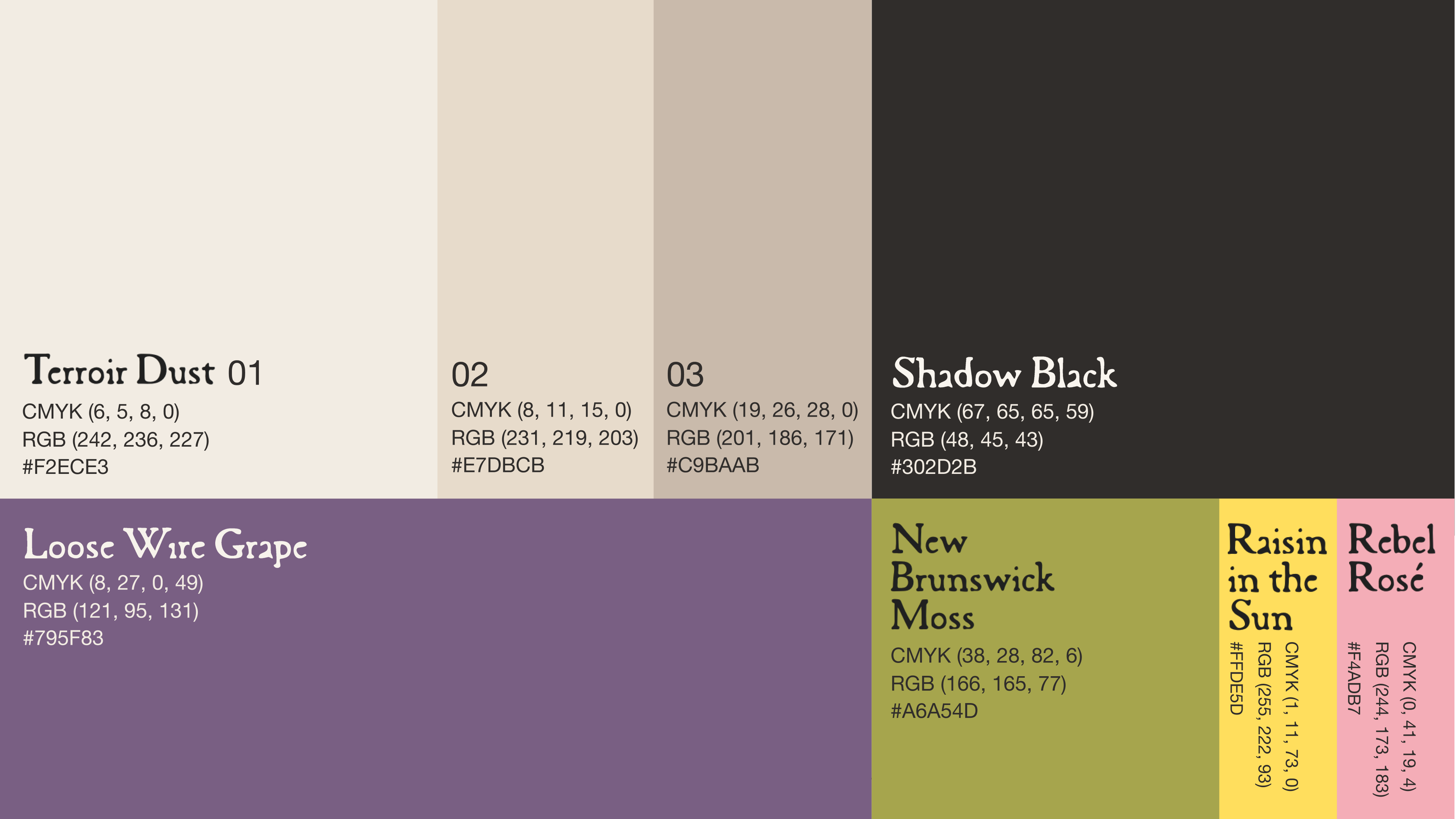
Brand Concept & Development
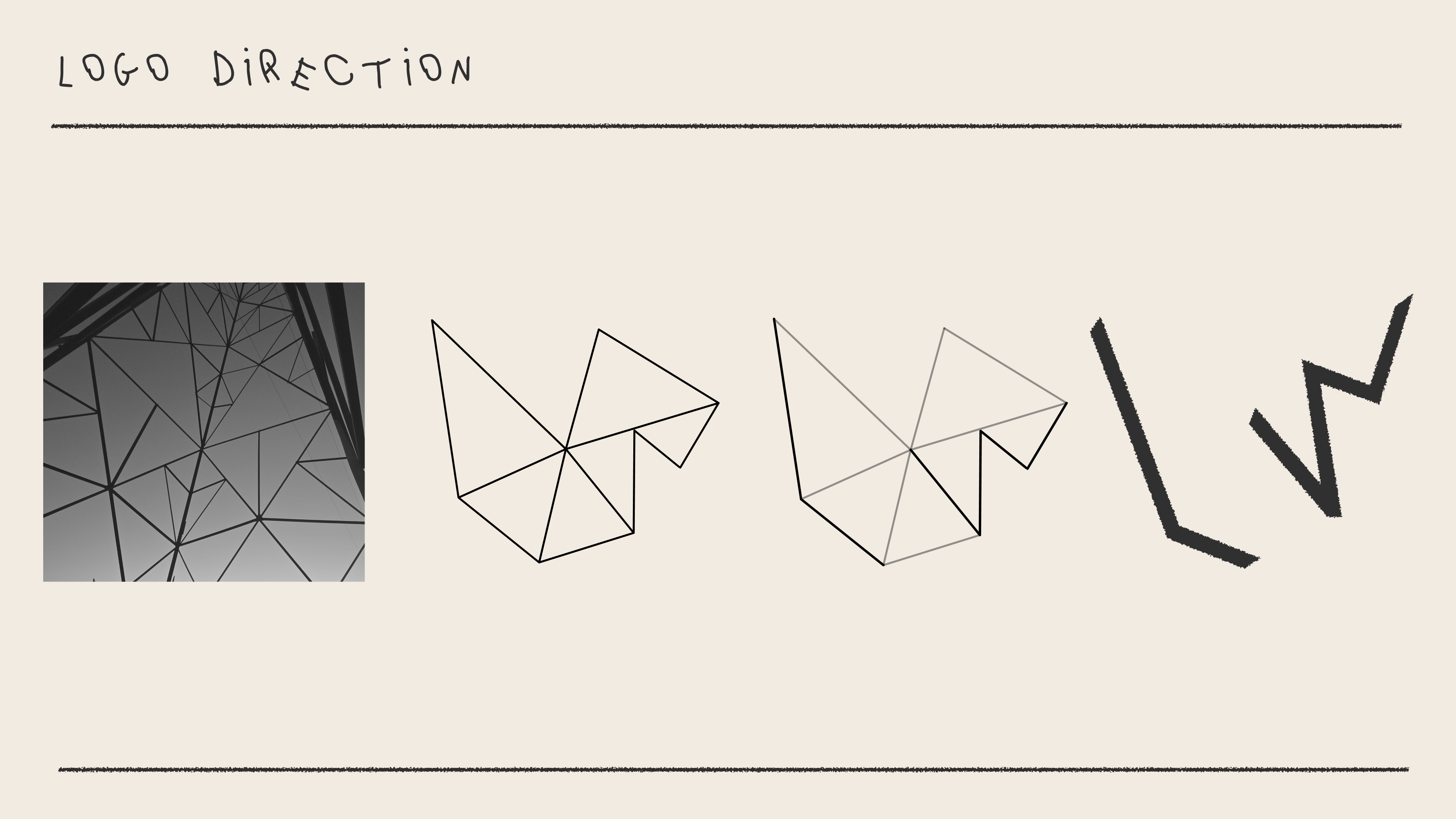
Building on research compiled by fellow designer Mark Paterson, I led an exploration to define Loose Wire’s market position. Through a SWOT analysis and Brand Onion, I helped focus the narrative on the inventor's spirit and the discipled craft required to make something daring from a difficult landscape. From this strategic foundation, I refined the core concept that would lead our visual direction. Working alongside Mark, we co-authored moodboards and moved through a rigorous process of thumbnailing and iteration to finalize a logo and label design that replaced traditional wine tropes with technical grit and creative intent.
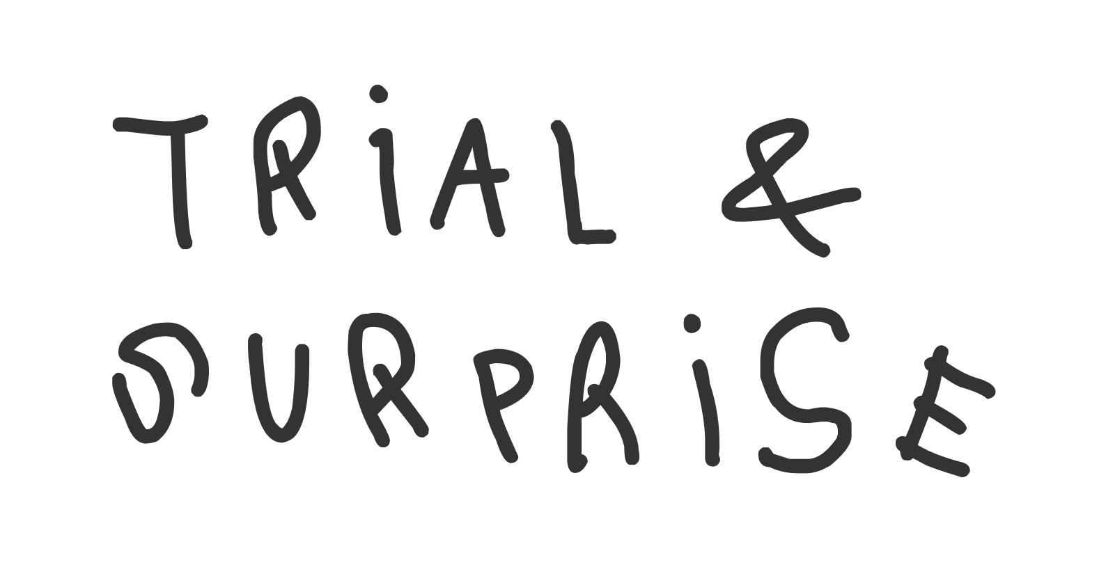
7,300 miles from Tuscany there is no room for guesswork, only the rigour of the experiment. We trade 'Trial and Error' for 'Trial and Surprise,' applying disciplined, time-tested processes to a landscape that shouldn't allow for success. By combining the precision of a scientist with the curiosity of the inventor, we turn the uncertainty of the North into a catalyst for discovery. Every bottle is a proven result: a surprisingly great outcome forged in an unexpected place.
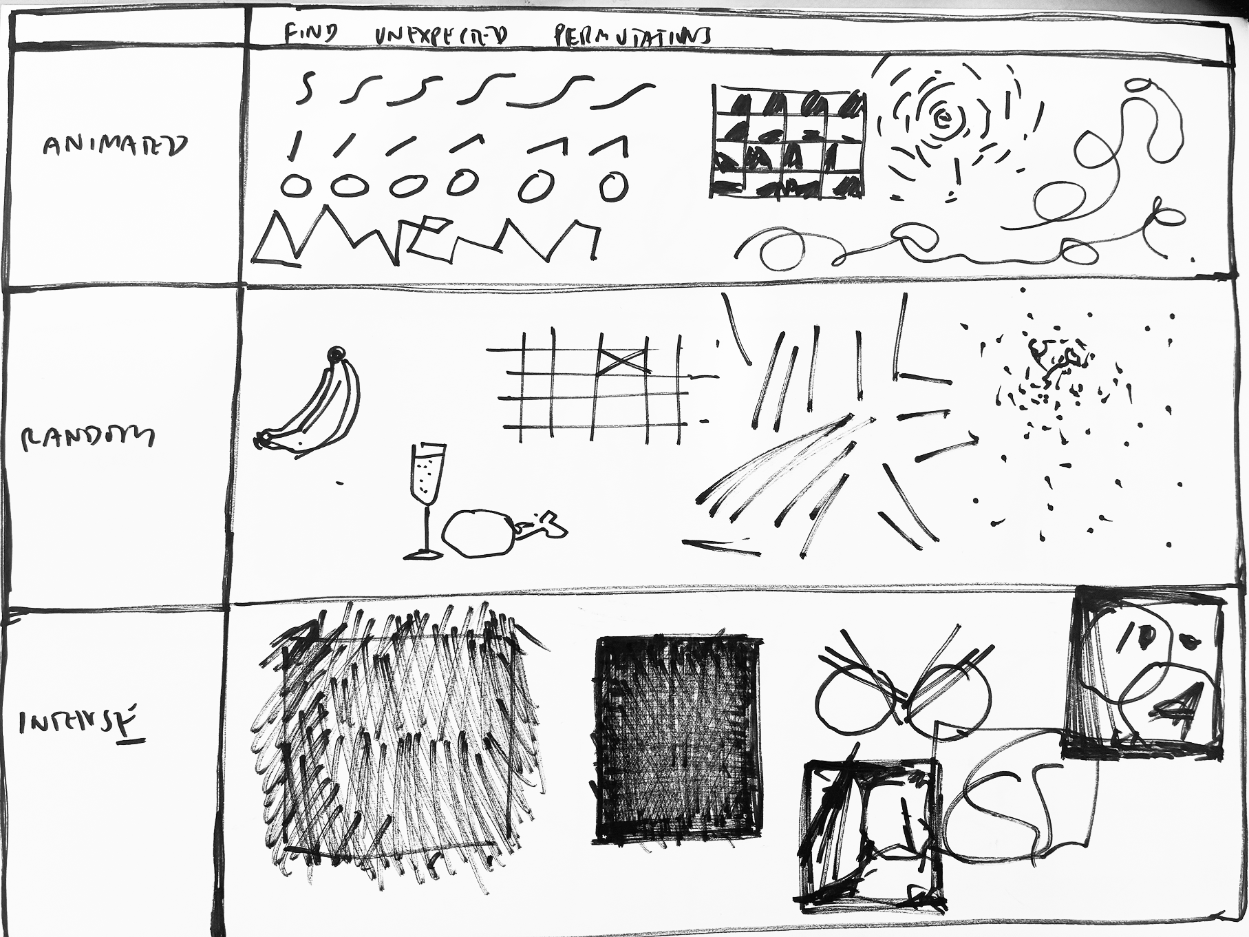
ANIMATED
RANDOM
INTENSE
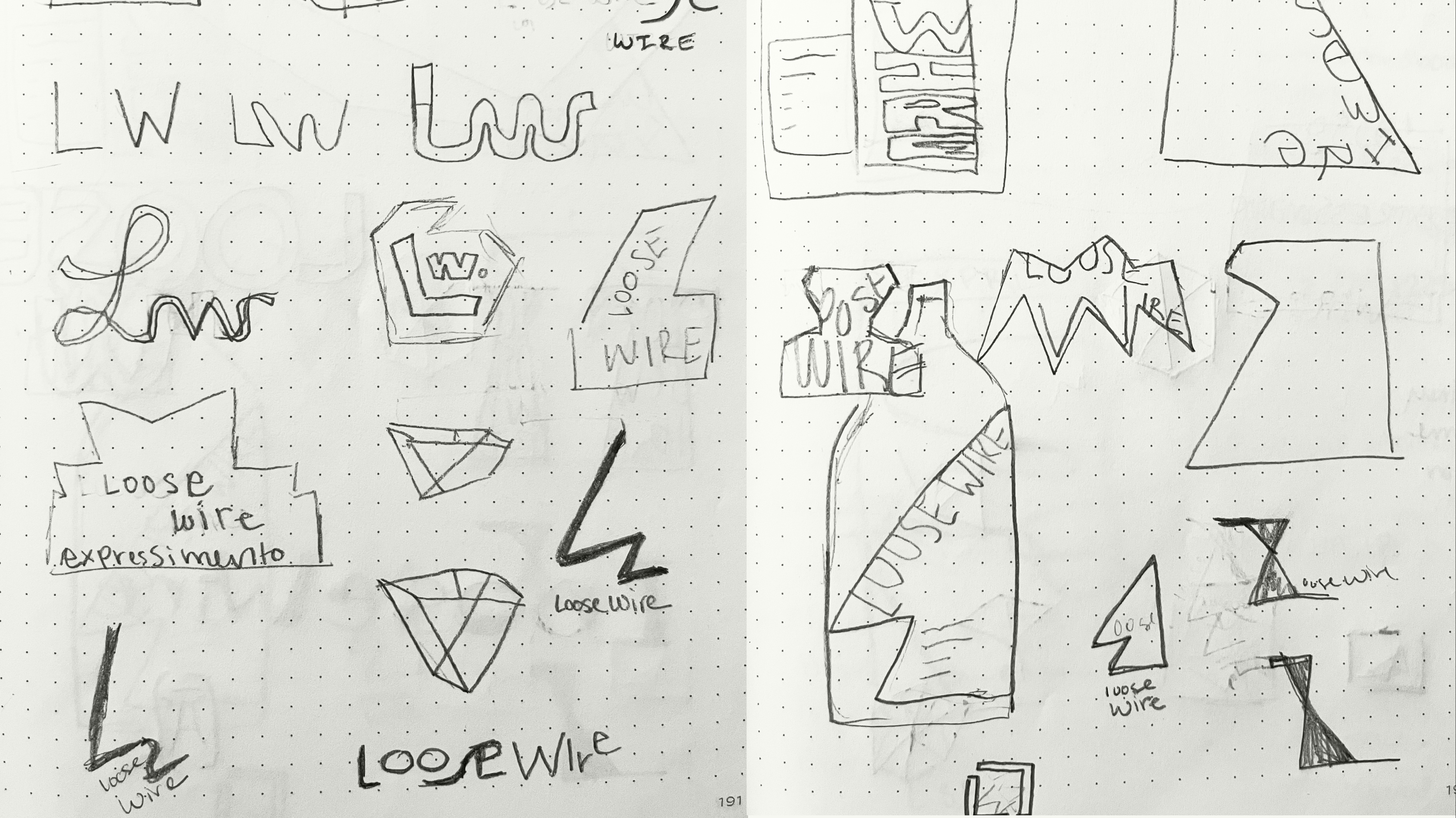
LOGO rollout


More Projects