
Scroll
Work example
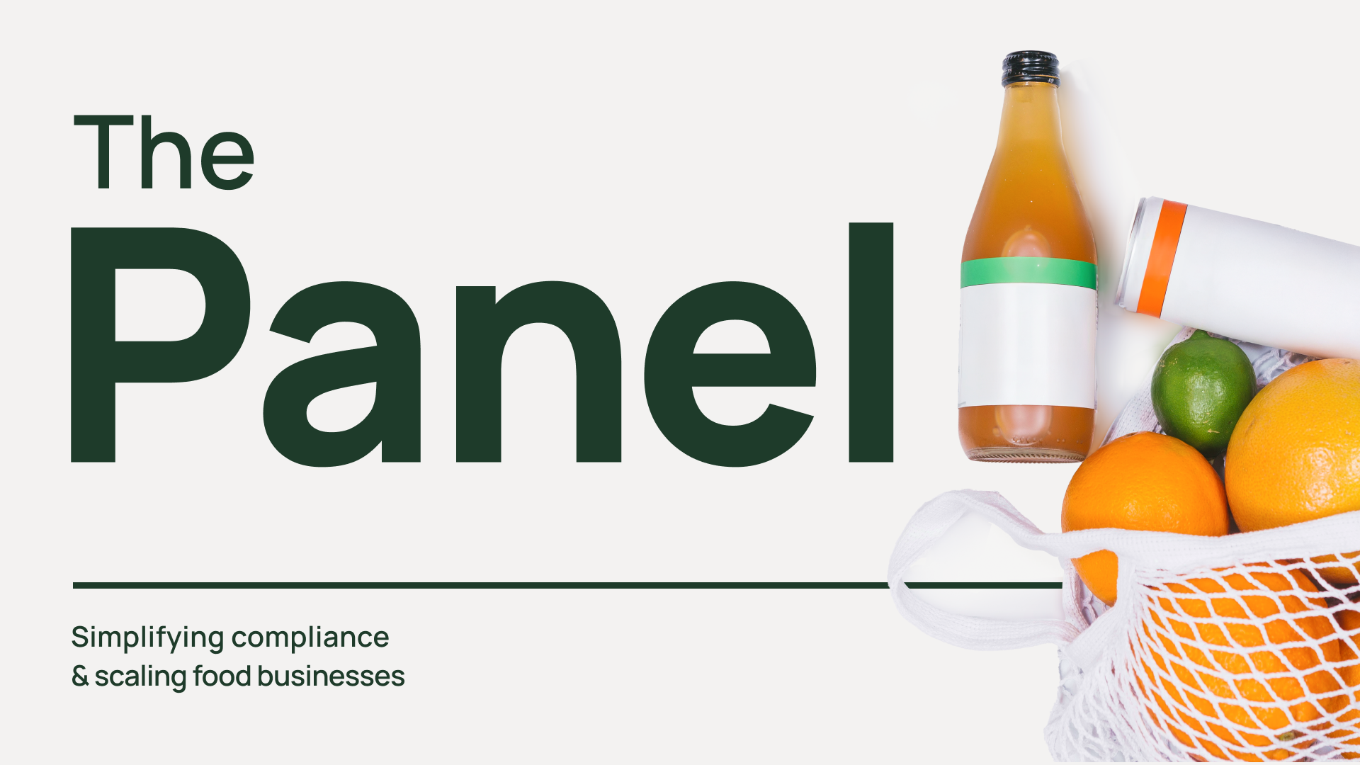
THE PANEL


Company Background
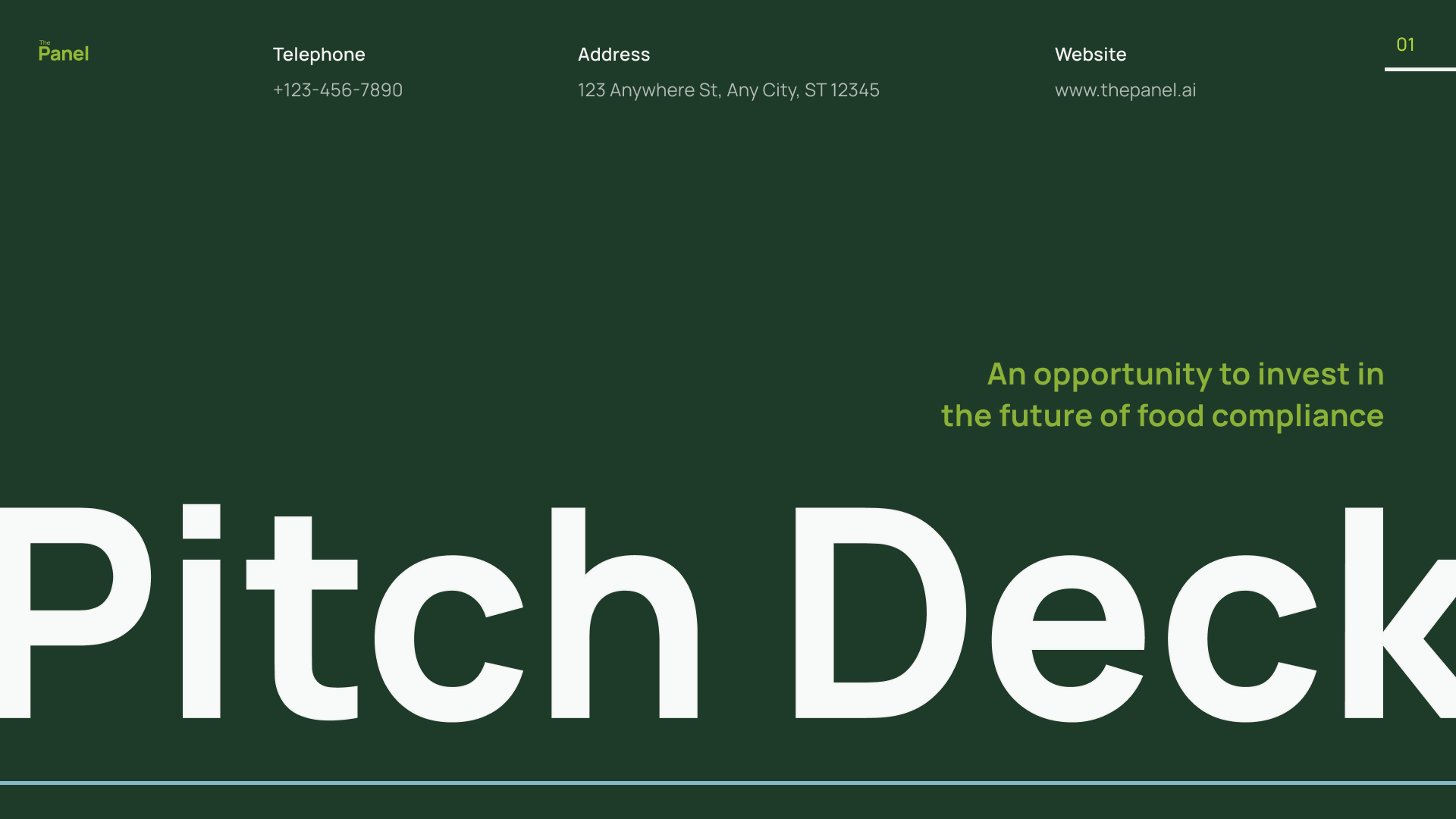
Founded by Eli Wolnerman, a food entrepreneur who scaled his local lemonade brand to national distribution, The Panel was born from his firsthand struggle with outdated compliance systems. He saw how expensive and time-consuming Process Authority Letters could be, and set out to build a modern, AI-powered platform to remove this bottleneck for small food businesses. This brand direction and MVP design were created to support his first round of investment pitching.
Challenge
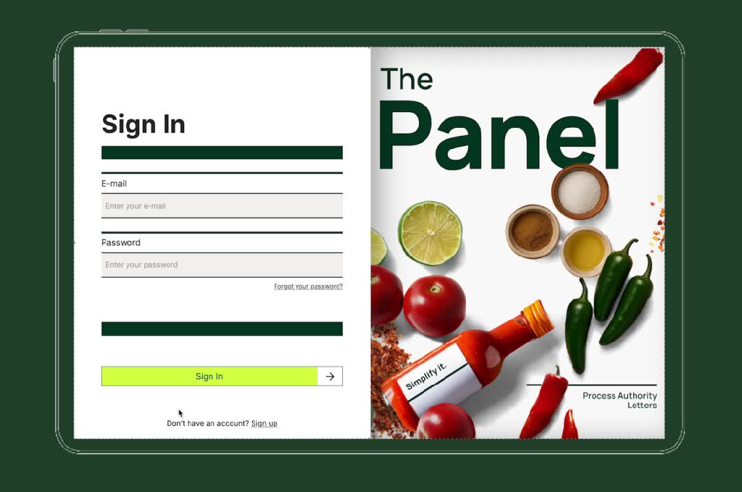
The design needed to speak to two audiences at once: potential investors looking for a sleek, scalable product, and food founders who might be more comfortable with pen-and-paper than tech platforms. The challenge was creating a brand that felt credible and future-facing, while remaining approachable and intuitive for non-technical users.
Goal
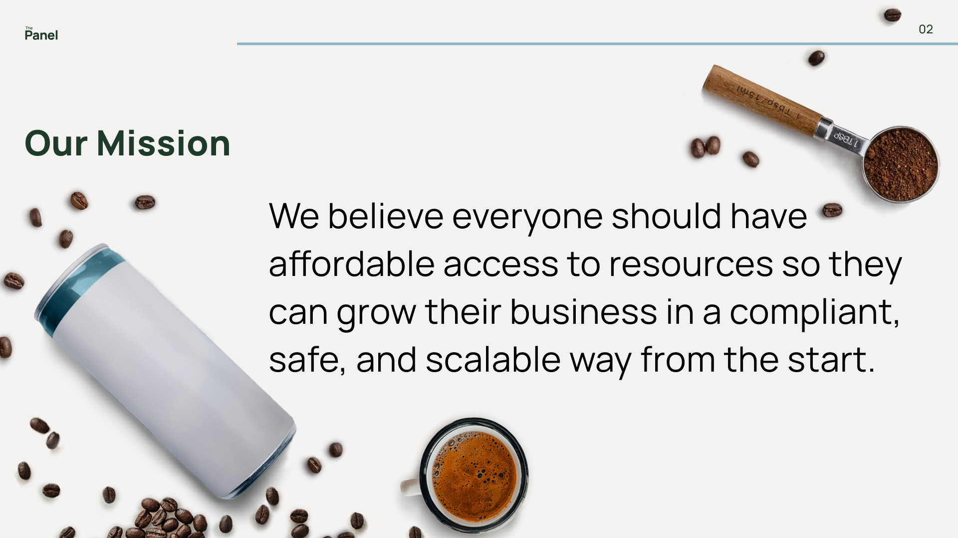
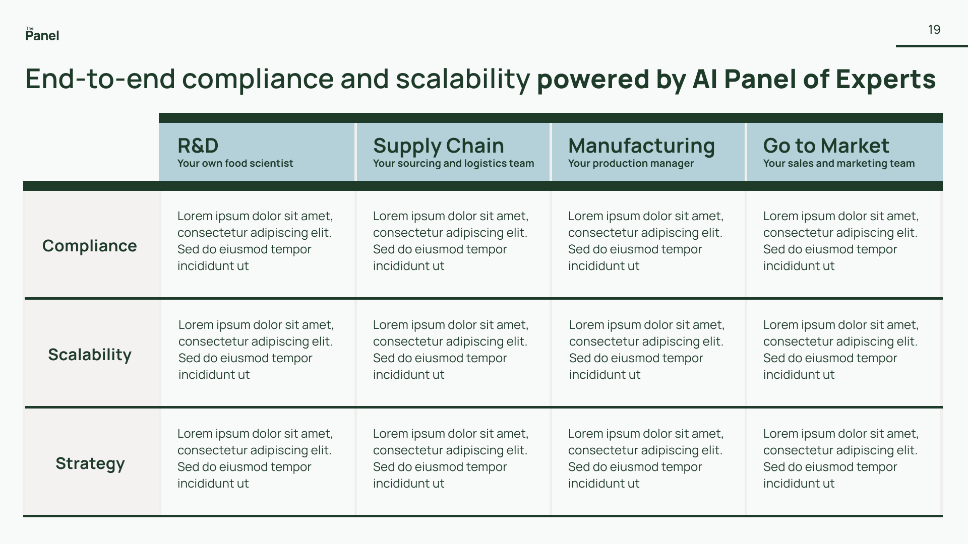
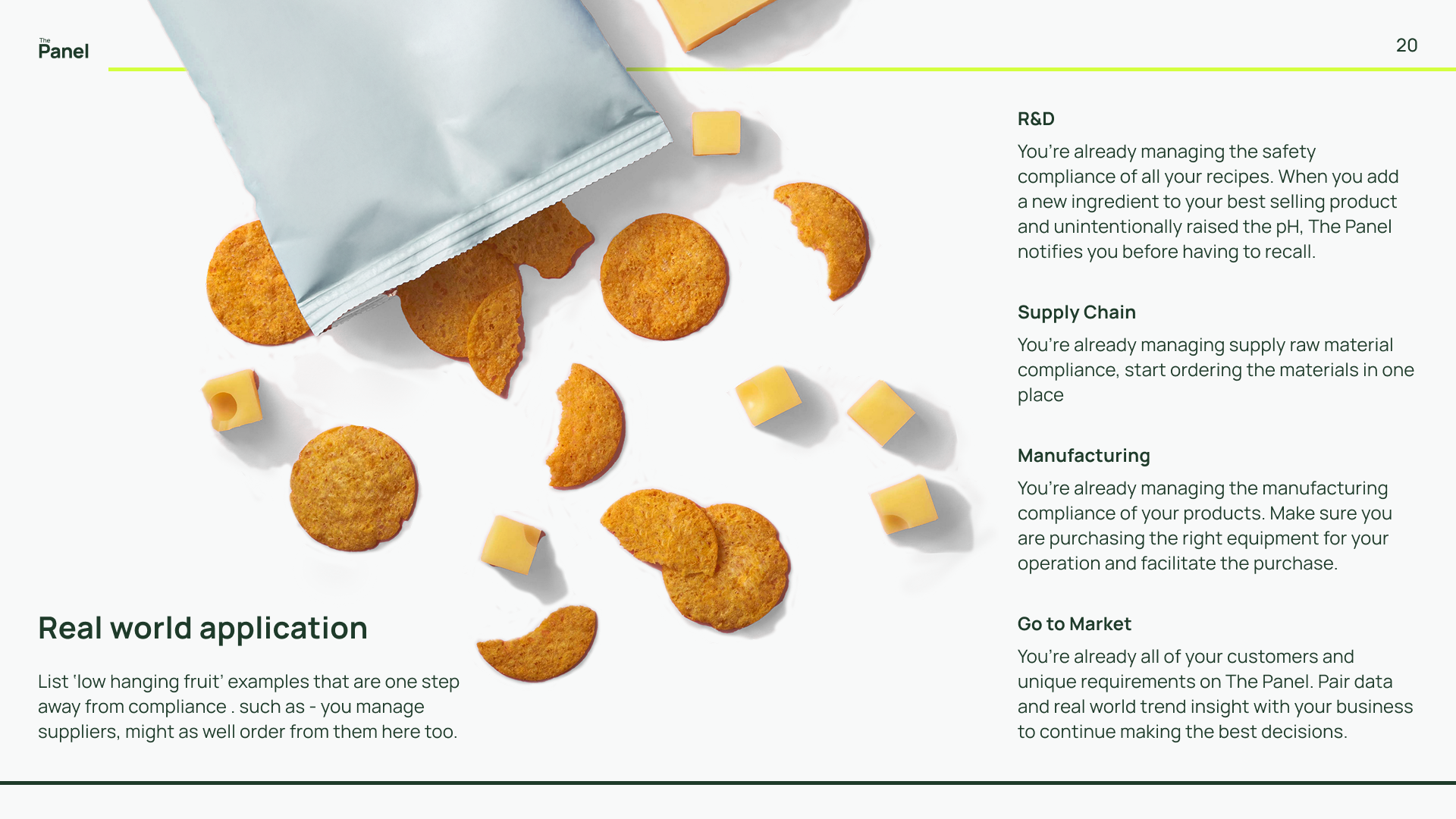
Position The Panel as both a practical tool and a visionary platform, simplifying compliance today while signaling its potential to evolve into a full-stack solution for the food industry.
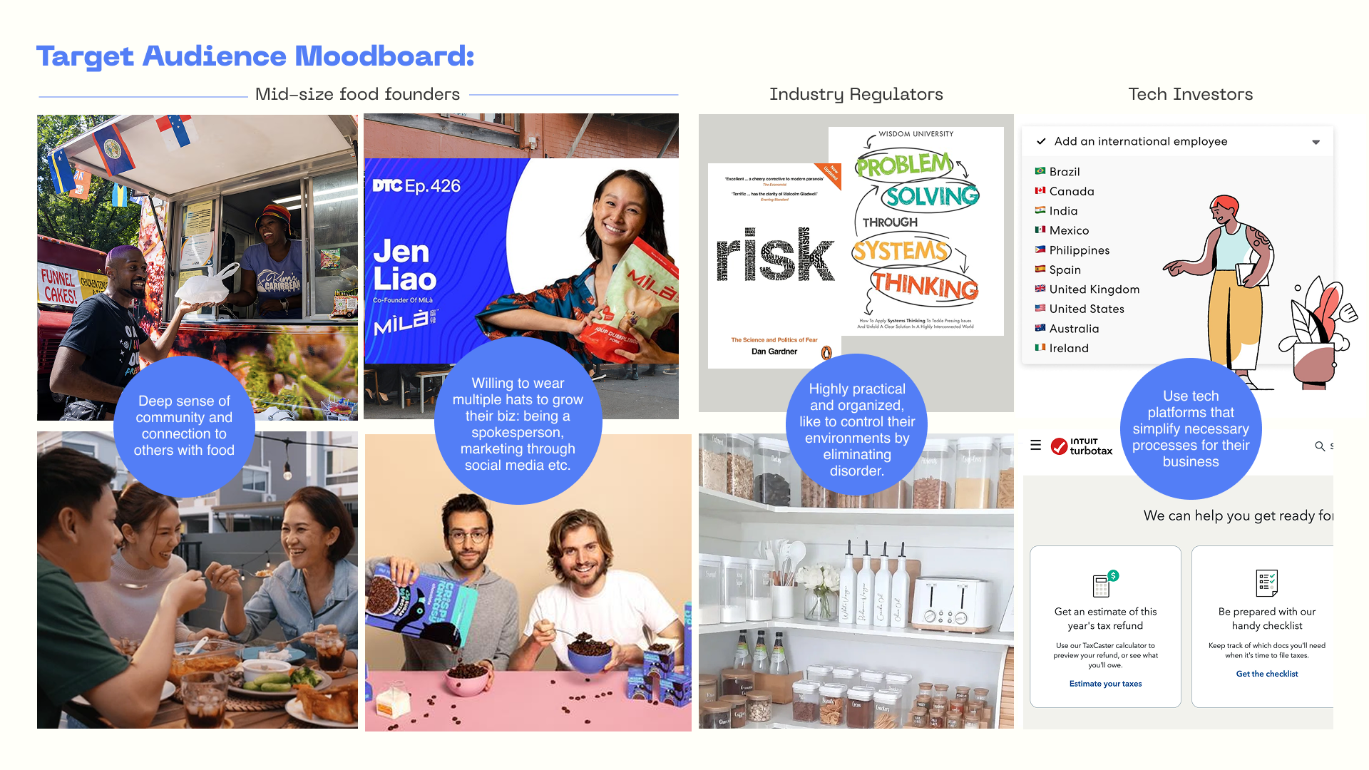
Target Audience
Early-stage food entrepreneurs seeking clear, quick, and affordable paths to market, and investors eager to back solutions in a growing but underserved space.
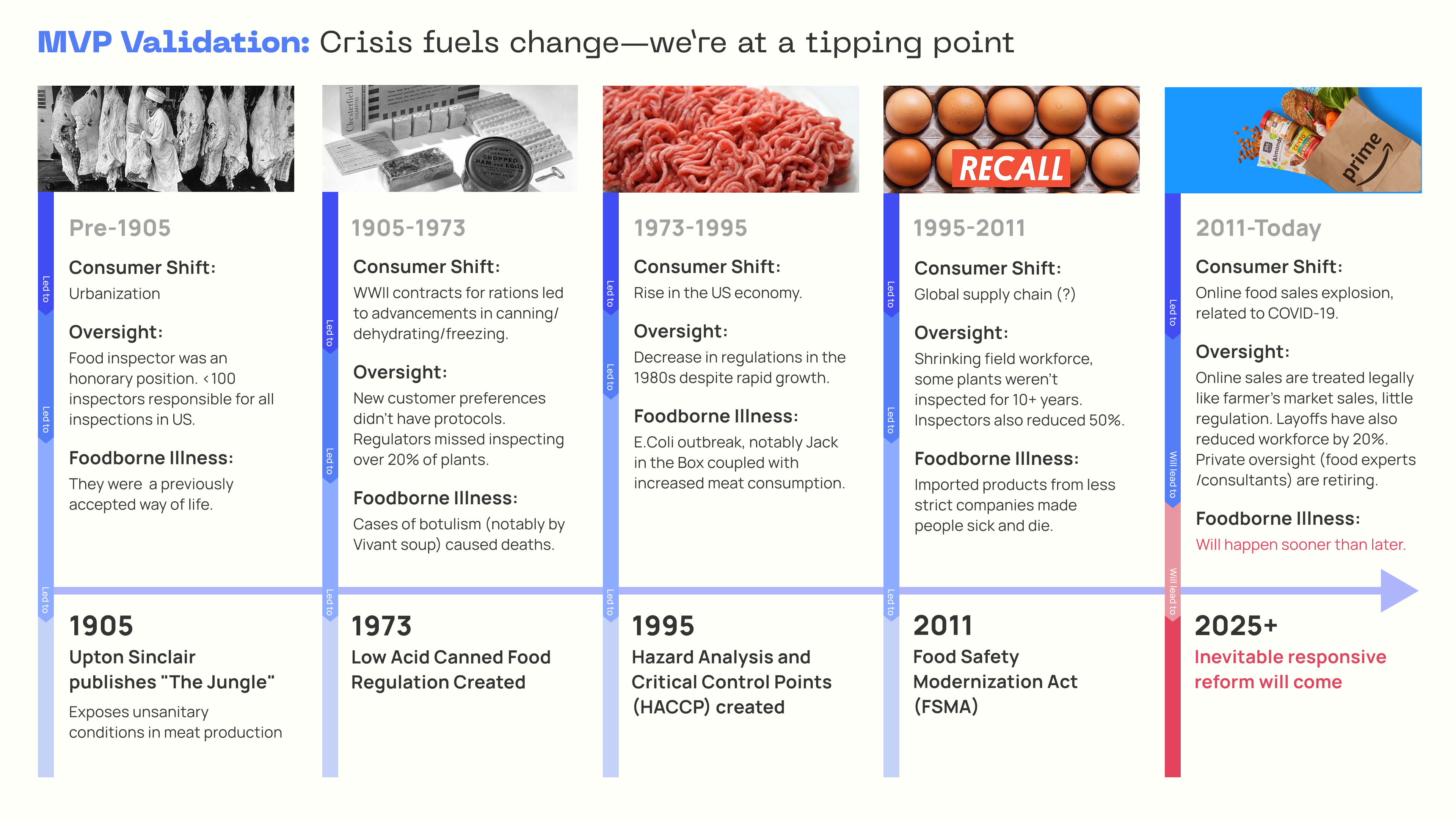
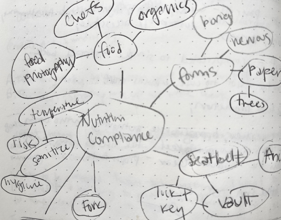
Research
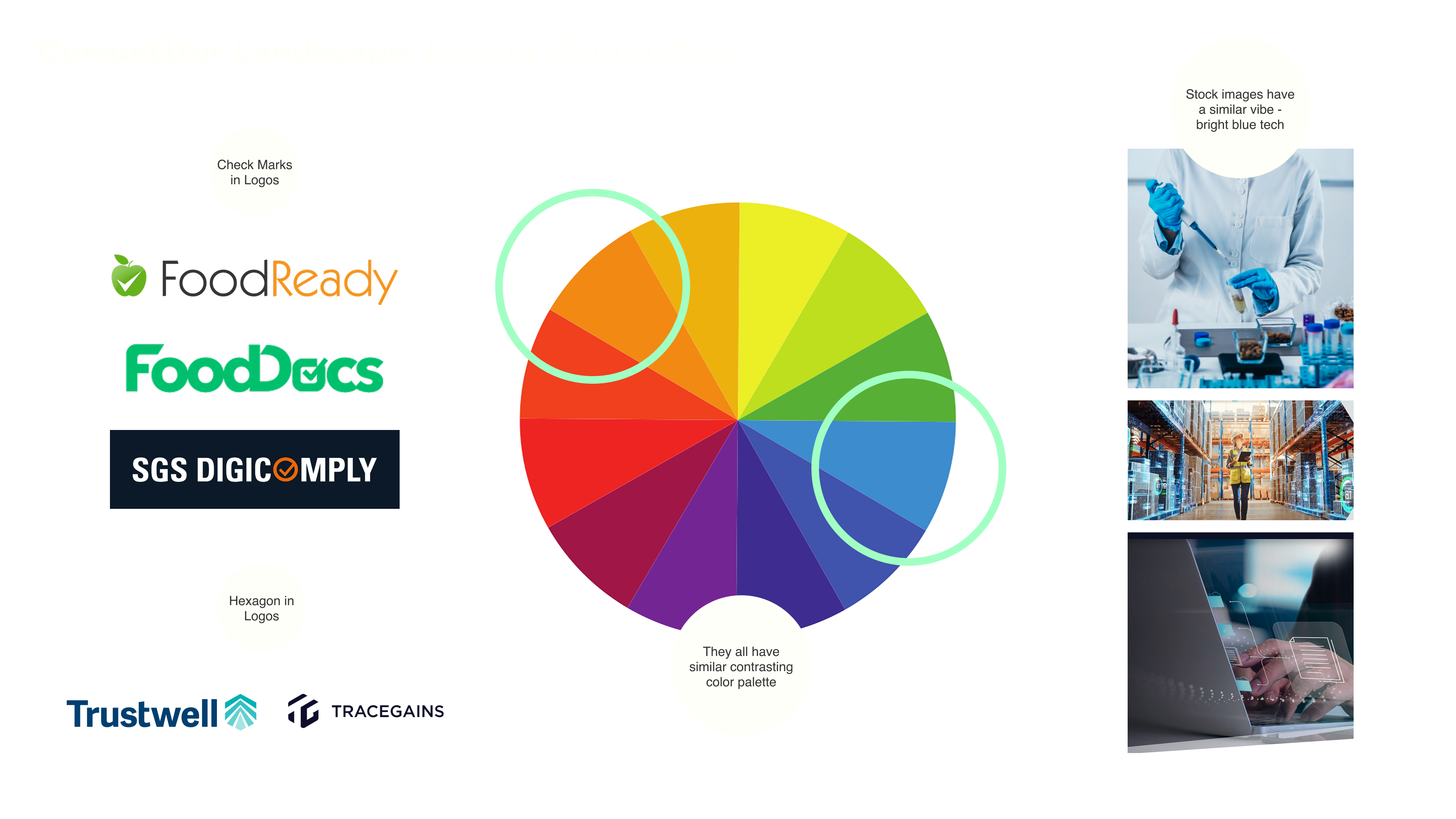
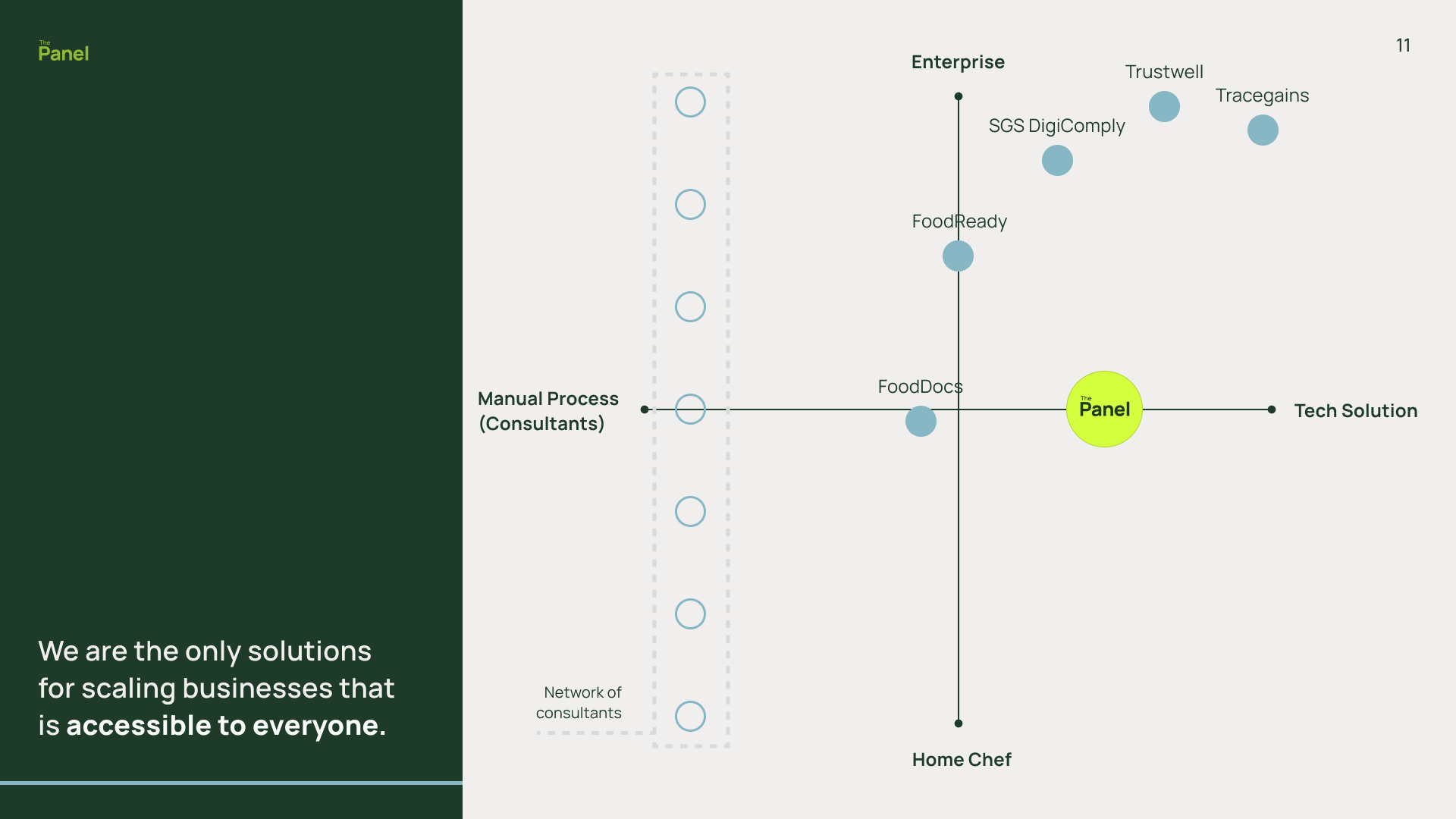
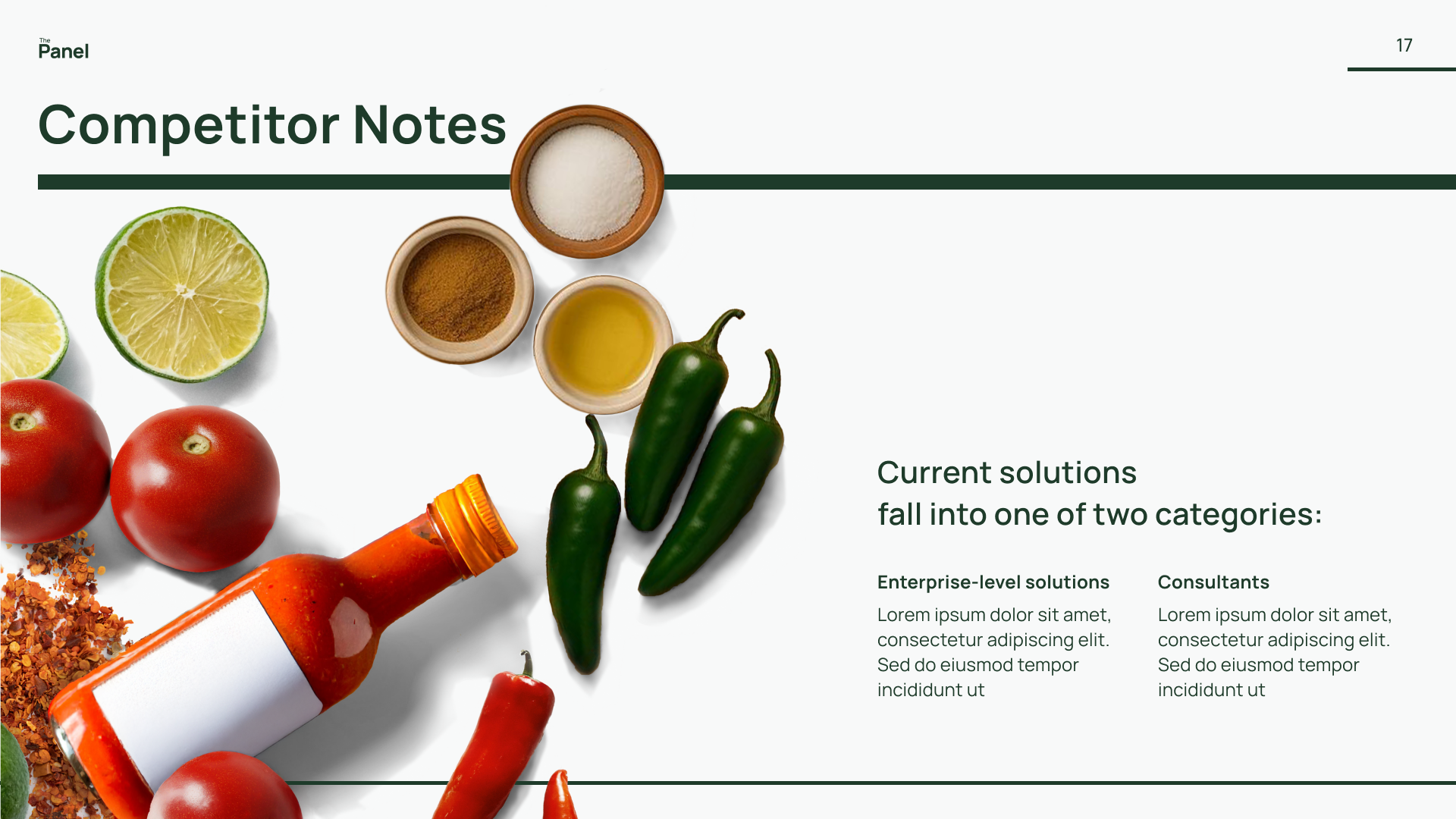
Competitor Landscape Matrix
Most existing players cluster around a reserved, visual style, some leaning traditional, others more modern. This creates a predictable space that lacks distinction. I identified an opportunity to stand apart by leaning into a more expressive brand direction: one that still conveys trust and authority, but with the energy and confidence.
Brand Concept & Development
By studying how regulations emerge, analyzing competitors, and considering the needs of founders, regulators, and investors, I shaped a direction that is credible yet expressive, designed to move food businesses forward. Inspired by the tension between outdated compliance systems and today’s fast-moving food industry, I built a brand concept that feels both modern and grounded.

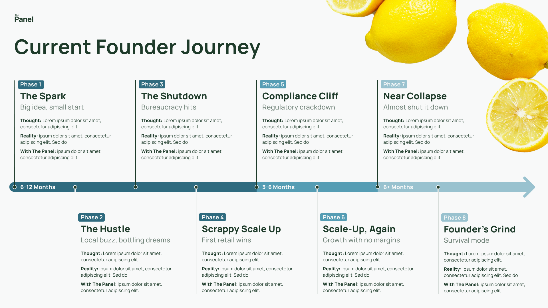
Just as recipes rely on the right mixes to succeed, founders need the proper tools, approvals, and support to bring their ideas to market.
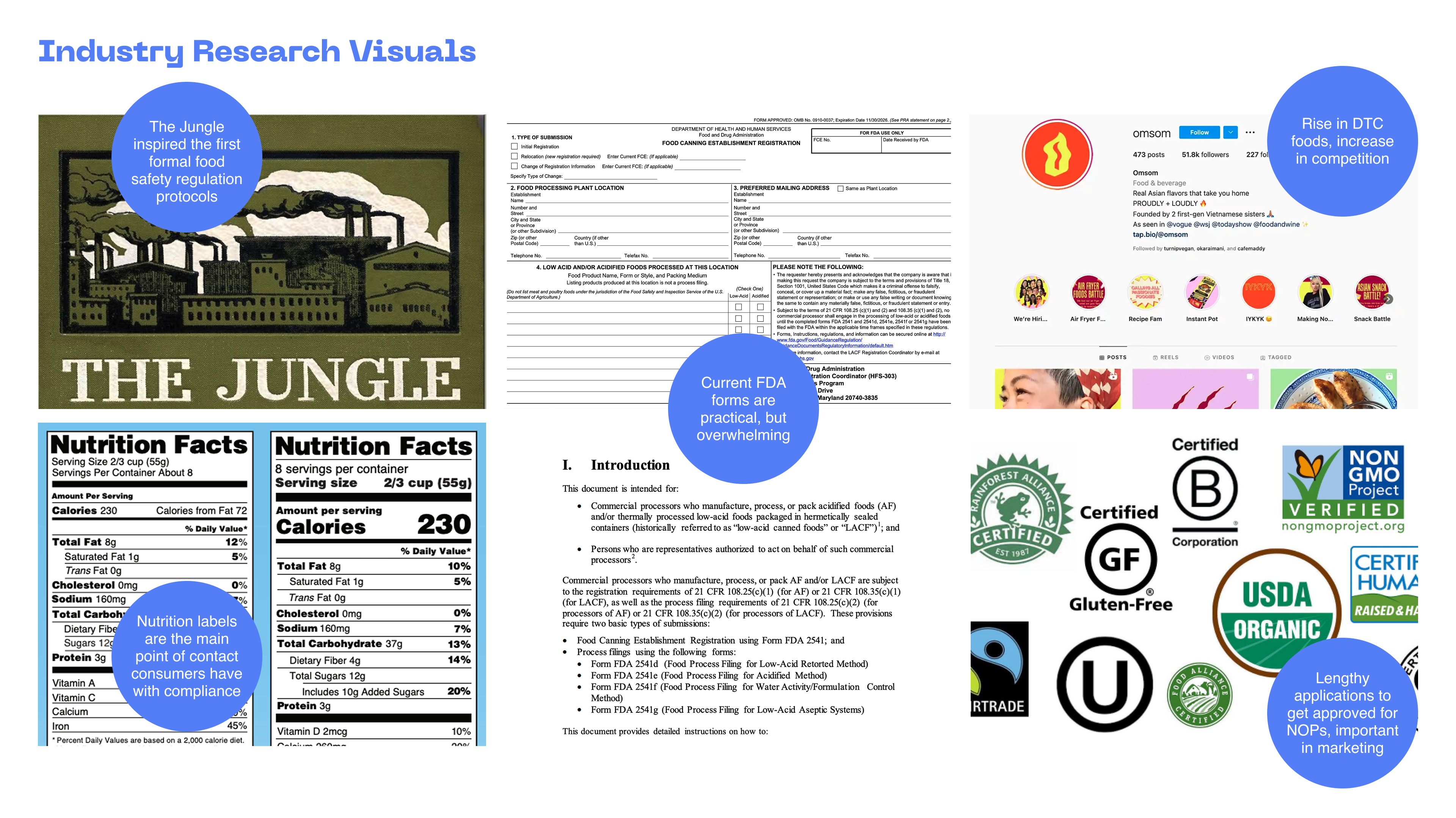
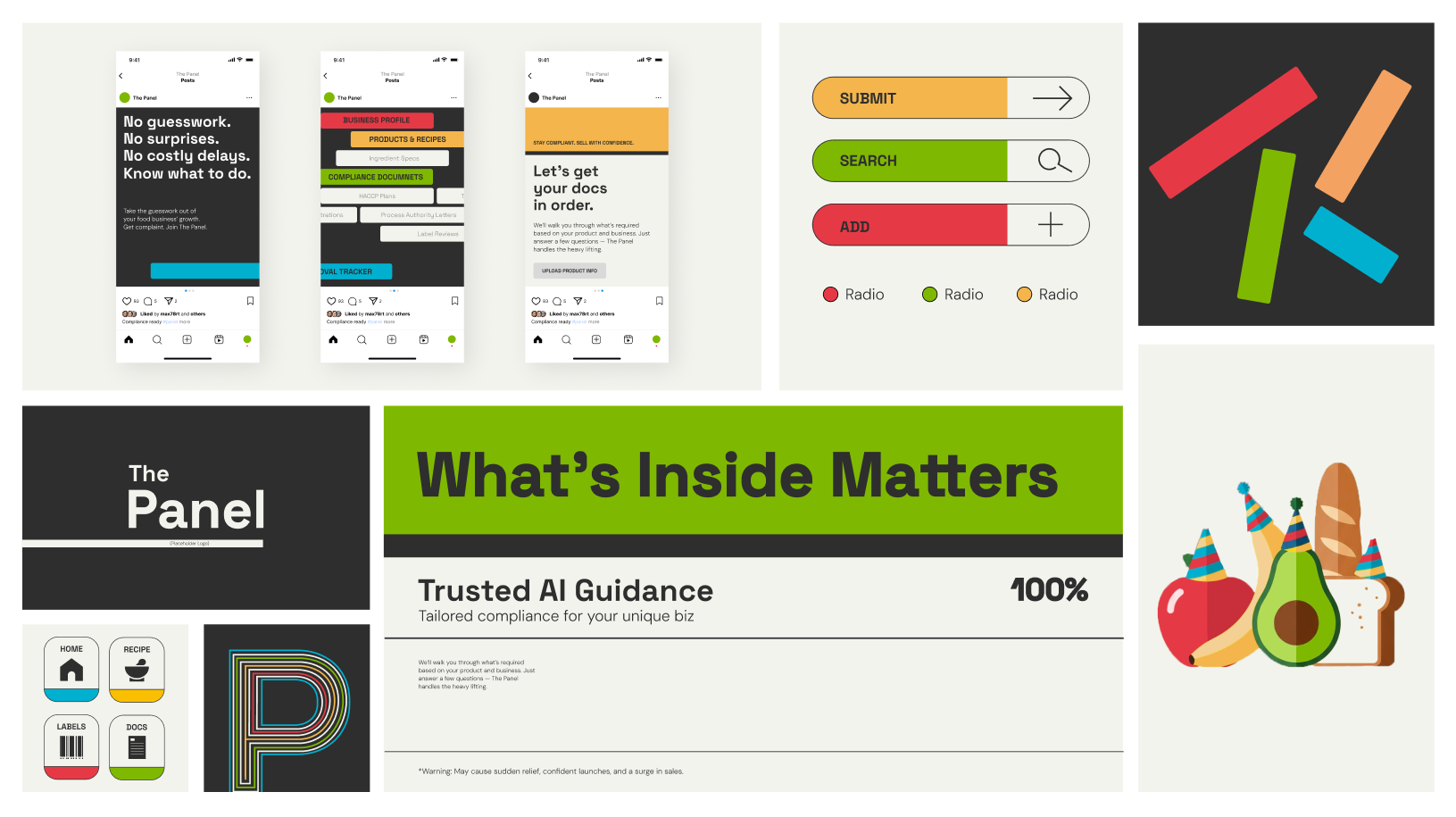
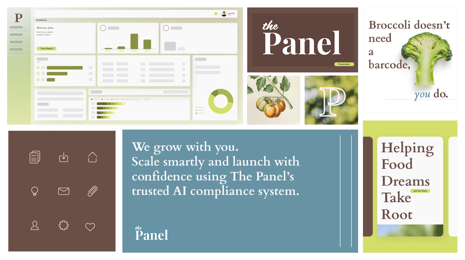
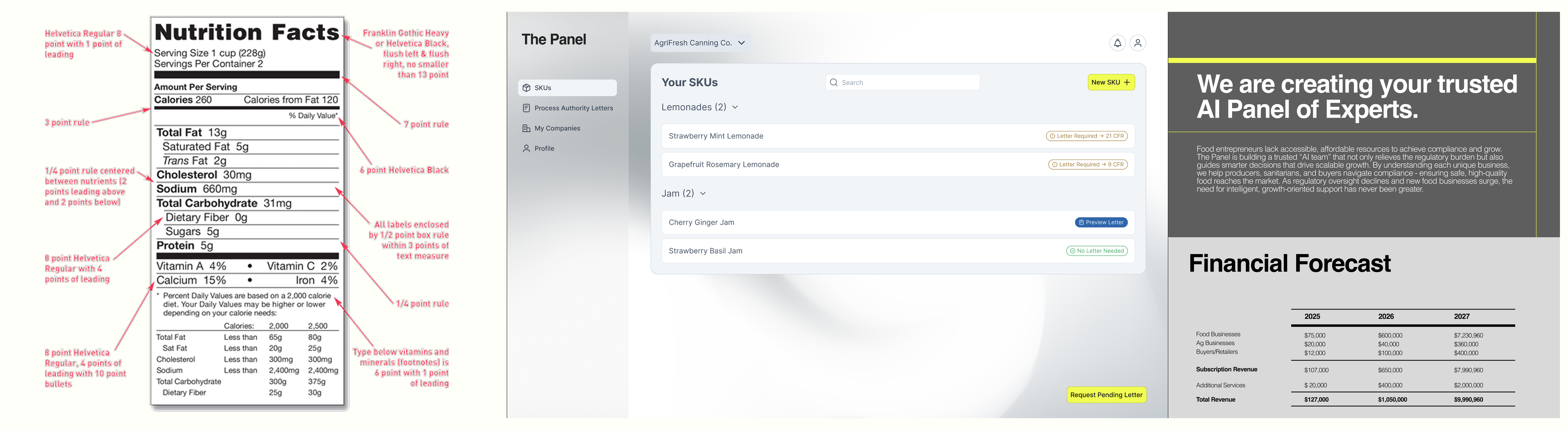
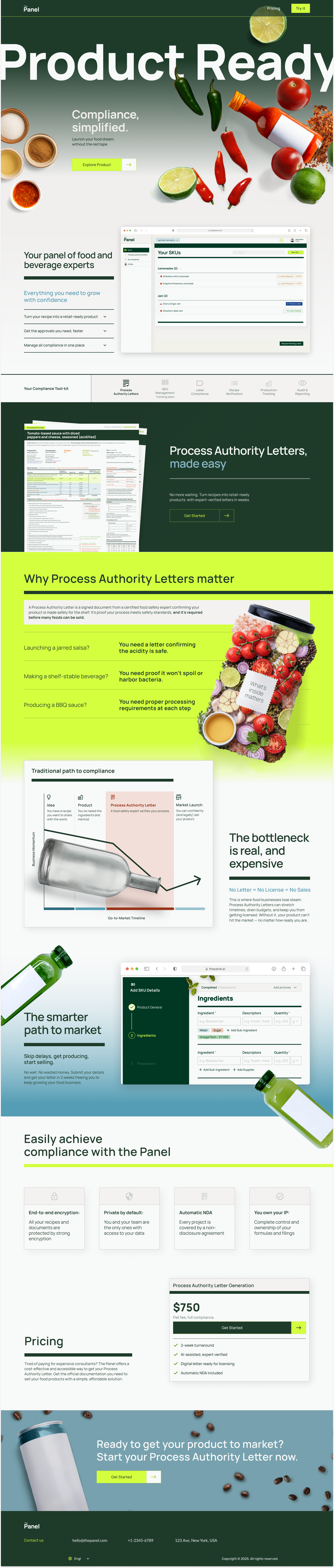
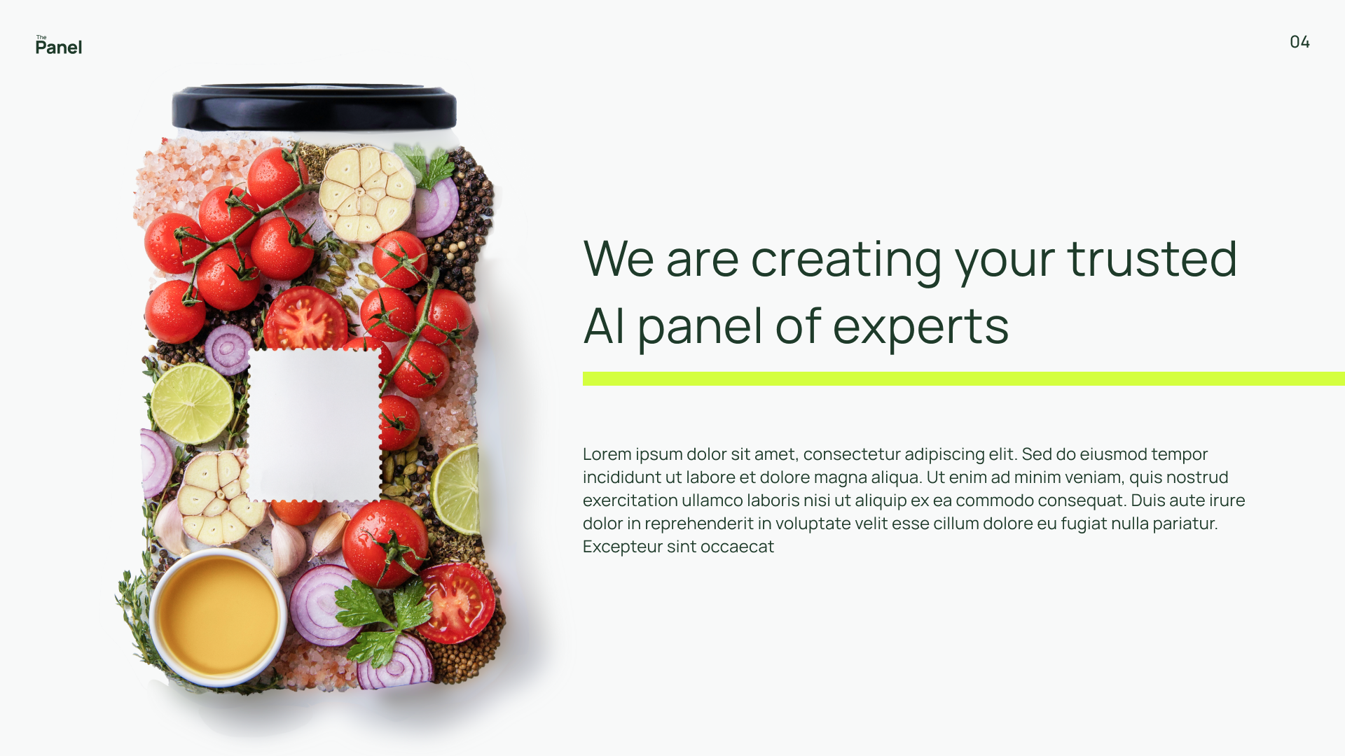
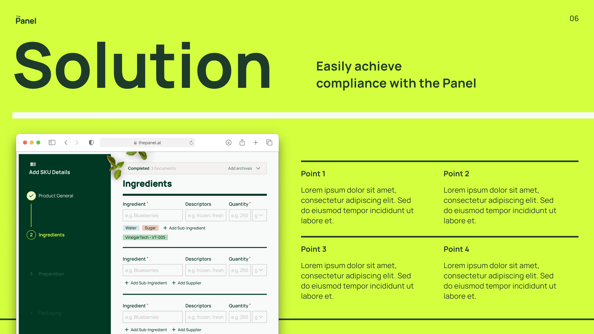
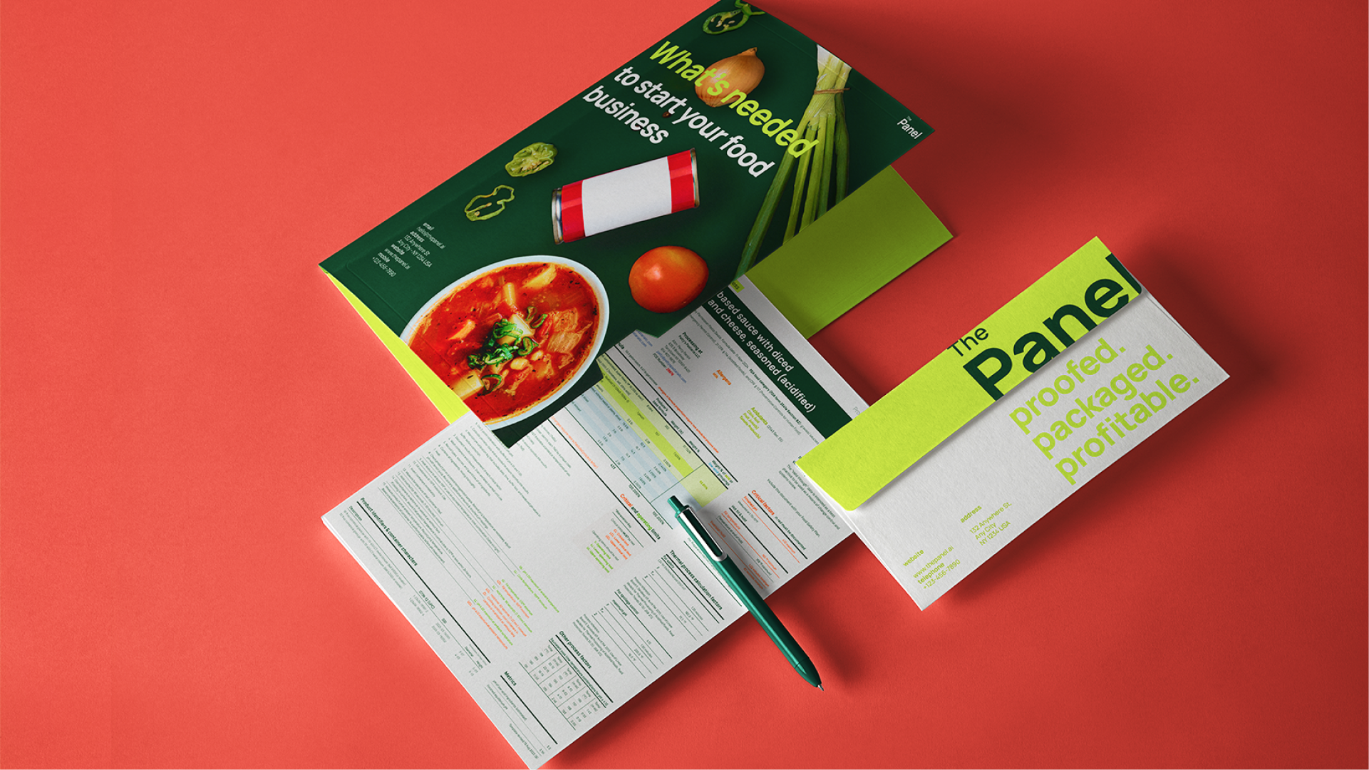
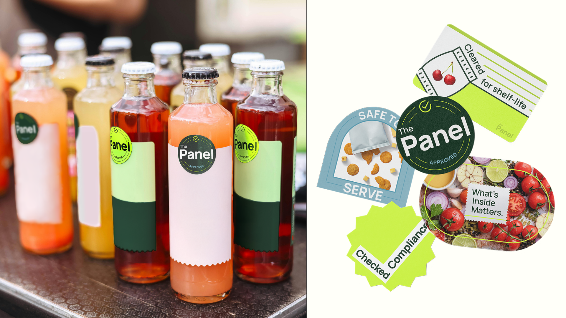
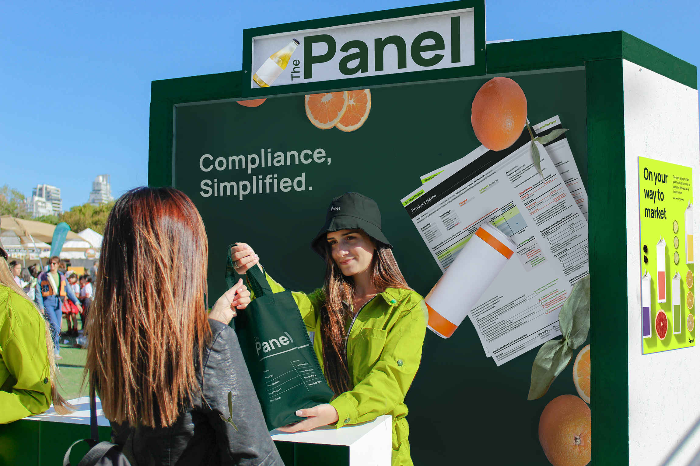
The nutrition panel, often people's first and most visible brush with compliance, became the core inspiration for design. Its linear structure and bold horizontal rules informed the layout, while Manrope, echoed Helvetica’s (nutrition panel font) clarity, anchored the brand in trust and legibility.
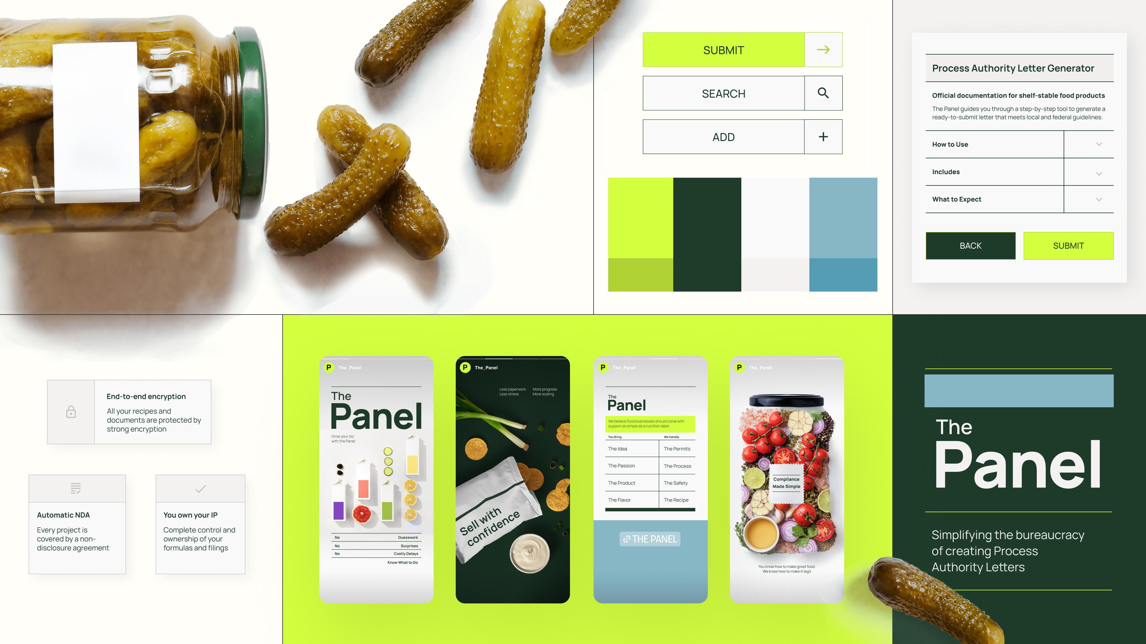
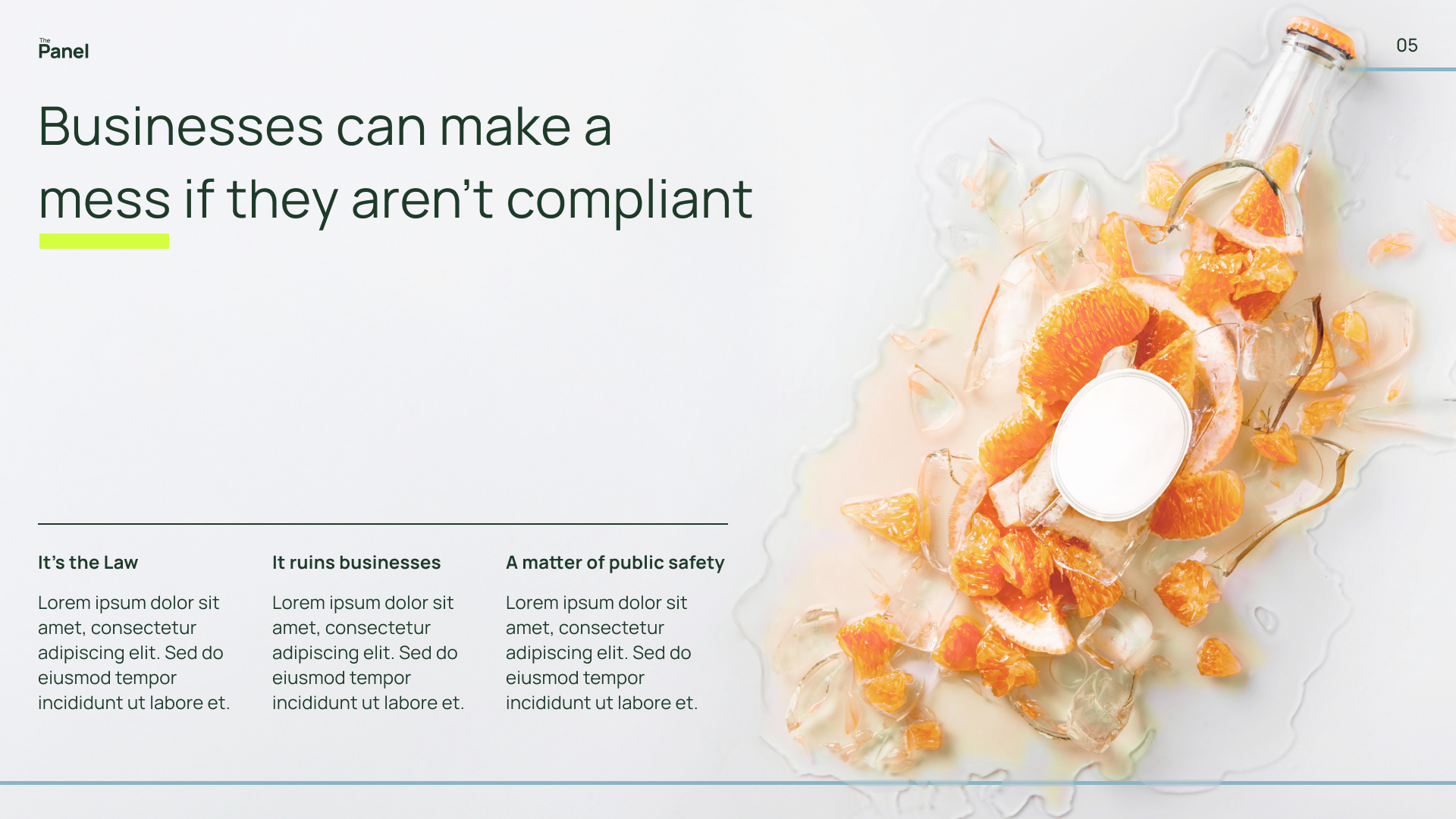
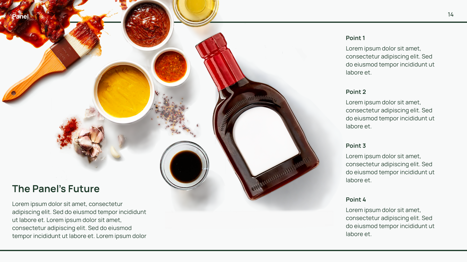
I combined type-driven layouts with scattered ingredients and food packaging images to show both the excitement of launching a product and the requirements of regulation.
The nutrition panel, often people's first and most visible brush with compliance, became the core inspiration for design. Its linear structure and bold horizontal rules informed the layout, while Manrope, echoed Helvetica’s (nutrition panel font) clarity, anchored the brand in trust and legibility.
I combined type-driven layouts with scattered ingredients and food packaging images to show both the excitement of launching a product and the requirements of regulation.
STRUCTURED
DYNAMIC
CREDIBLE
Brand Concept Exploration
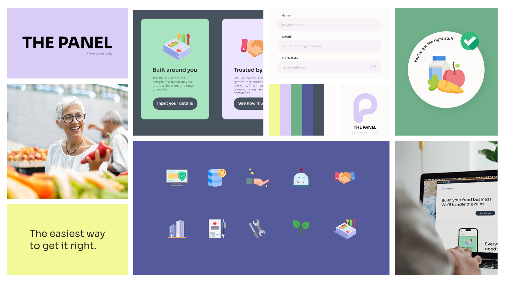
Brand rollout


More Projects

